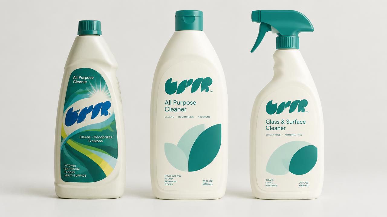
Photorealistic studio shot of a modernized SparkleClean All-Purpose Cleaner spray bottle, presented in a retail environment. The bottle features a sleek, ergonomic form factor crafted from frosted, recycled PET, imparting a premium, tactile feel. The design subtly updates the iconic SparkleClean starburst logo, refining its lines and proportions while maintaining instant brand recognition. The primary color palette for the label is a sophisticated blend of a soft, refreshed SparkleClean blue, complemented by a clean, modern white, and accented with subtle metallic silver elements on the spray trigger and collar. The label itself has a contemporary matte laminate finish, with a selective spot gloss applied to the updated SparkleClean logo and key product benefits, enhancing visual pop and perceived quality. A subtle, debossed pattern is integrated into the bottle's grip area for improved ergonomics and a premium touch, reflecting material awareness. The overall aesthetic is clean, modern, and trustworthy, conveying efficacy without being aggressive. The product is positioned on a brightly lit, well-organized supermarket shelf, surrounded by other premium household cleaning products, specifically designed to demonstrate strong shelf impact. Ensure ample, clearly defined rectangular areas on the back and sides of the bottle for future regulatory text and ingredient lists, without rendering any actual text, to imply compliance. The focus is on the packaging's material quality, updated branding, and shelf appeal. Avoid any cartoonish elements, blurry or low-resolution imagery, cheap plastic appearance, overly vibrant or neon colors, outdated design cues, generic stock photography, distorted perspectives, empty or poorly lit shelves, and any visible text artifacts or gibberish.