Image AILogos & MarksIntermediate60 minSaves 1 hour

Refining Wordmarks for Luxury Fashion Sub-Brands

Brand designers need to quickly generate and iterate on wordmark concepts for new luxury fashion sub-lines, ensuring visual alignment with the parent brand while establishing a distinct identity.

This prompt guides image AI to generate sophisticated wordmark explorations for luxury fashion sub-lines. It focuses on integrating specific typographic styles and visual cues that resonate with a parent brand's aesthetic, providing multiple variants and negative space considerations for design review.

READY-TO-USE PROMPT

Copy Prompt

prompt.txt
As a brand designer, your objective is to develop a series of wordmark concepts for a new luxury fashion sub-line. The sub-line, named `{{sub_line_name}}`, needs to visually complement its parent brand, `{{parent_brand_name}}`, while establishing its own unique identity within the luxury market.

Context:
The parent brand, `{{parent_brand_name}}`, is known for its `{{parent_brand_aesthetic}}`. The sub-line, `{{sub_line_name}}`, aims to capture `{{sub_line_concept}}`. The wordmark must convey sophistication and exclusivity, suitable for high-end apparel, accessories, and digital presence.

Task:
Generate three distinct wordmark variants for `{{sub_line_name}}`. Each variant should explore a different typographic approach while maintaining a cohesive luxury feel. For each variant, also provide a negative space consideration or an inverse version suitable for dark backgrounds.

Constraints:
1.  **Usage:** The wordmark will primarily be used on product tags, packaging, digital marketing, and potentially embroidered onto garments. It must be legible at small sizes and scalable for larger applications.
2.  **Style:** The overall aesthetic should be minimalist yet refined, avoiding overly ornate or trendy elements. Focus on timeless elegance.
3.  **Typography Vibe:** Explore options that convey `{{desired_typographic_vibe}}` (e.g., classic serif, modern sans-serif, elegant script, geometric, humanist). Ensure the chosen typeface supports the luxury positioning.
4.  **Symbol Direction (Optional but encouraged):** If a subtle symbolic element is integrated, it should be abstract and sophisticated, not literal. Consider `{{symbol_direction}}` (e.g., abstract geometric, subtle organic curve, initial-based monogram).
5.  **Color Palette:** Primarily monochrome (black, white, shades of grey) for initial exploration.
6.  **Deliverables:** For each of the three variants, provide:
    *   The primary wordmark design.
    *   A brief explanation of the typographic choices and their rationale.
    *   A negative space or inverse version of the wordmark.

Output:
Present three distinct wordmark concepts. For each concept, include the wordmark image, a short textual description of its design intent and typographic characteristics, and an inverse version. Ensure the output is clean and ready for design review.

Estimated results

DifficultyIntermediate
Setup time60 min
Time saved1 hour
Best modelsMidjourney, Flux
Best audienceFashion, Luxury Goods

Editor's note

Why this prompt matters

Brand designers frequently face the challenge of extending an established luxury brand into a new sub-line. The objective is to create a distinct identity that resonates with a specific audience, yet remains clearly tethered to the parent brand's prestige and aesthetic. This requires a delicate balance, particularly in the initial stages of wordmark exploration where foundational visual language is set.

This workflow is designed for brand designers and creative directors in luxury fashion houses who need to quickly generate and iterate on wordmark concepts for these new ventures. It addresses the common hurdle of translating abstract brand concepts into tangible typographic expressions, providing a structured approach to ideation. By articulating key attributes of both the parent and sub-line brands, the system can produce focused visual directions.

Reaching for this workflow when launching a new sub-brand allows for rapid prototyping of visual identity elements. It streamlines the initial conceptual phase, enabling designers to present diverse, well-reasoned wordmark options to stakeholders faster. This focused generation helps in aligning creative vision early, ensuring that the sub-line's visual identity reinforces its market positioning without diluting the parent brand's equity.

Anatomy

Prompt engineering breakdown

Role

As a brand designer, your objective is to develop a series of wordmark concepts for a new luxury fashion sub-line.

Context

The sub-line, `{{sub_line_name}}`, needs to visually complement its parent brand, `{{parent_brand_name}}`, while establishing its own unique identity within the luxury market. Parent brand aesthetic is `{{parent_brand_aesthetic}}`, sub-line aims to capture `{{sub_line_concept}}`. The wordmark must convey sophistication and exclusivity, suitable for high-end apparel, accessories, and digital presence.

Goal

Generate three distinct wordmark variants for `{{sub_line_name}}`. Each variant should explore a different typographic approach while maintaining a cohesive luxury feel. For each variant, also provide a negative space consideration or an inverse version suitable for dark backgrounds.

Constraints

Usage (product tags, packaging, digital, embroidery, legible small, scalable large), Style (minimalist, refined, timeless elegance, no ornate/trendy), Typography Vibe (`{{desired_typographic_vibe}}`), Symbol Direction (optional, abstract, sophisticated, `{{symbol_direction}}`), Color Palette (monochrome), Deliverables (primary wordmark, explanation, inverse version for each of 3 variants).

Output format

Present three distinct wordmark concepts. For each concept, include the wordmark image, a short textual description of its design intent and typographic characteristics, and an inverse version. Ensure the output is clean and ready for design review.

Why this structure works

The prompt uses role priming to establish the AI's persona as a brand designer, which focuses its output on design principles and rationale. Explicit constraints on usage, style, typography, and color ensure the generated concepts meet specific brand guidelines. The detailed output format specification guides the AI to deliver structured results, making them directly usable for review.

Pick your version

Prompt variations

BeginnerWorks with any model

For quick initial ideas or when specific brand details are still evolving, requiring less detailed input.

prompt.txt
As a design assistant, create three simple wordmark ideas for a new luxury sub-brand named `{{sub_line_name}}`. This sub-brand needs its own look while still feeling like part of a luxury parent brand. Focus on elegant typography, like a `{{desired_typographic_vibe}}` style. For each idea, show the main wordmark and a reversed version for dark backgrounds. Keep the designs clean and easy to read, suitable for things like product tags and websites. The goal is sophistication and exclusivity, using only black, white, and grey colors.
ProfessionalBest with midjourney

When detailed brand guidelines are established and a comprehensive exploration of typographic and symbolic elements is required for design review.

prompt.txt
As a brand designer, your objective is to develop a series of wordmark concepts for a new luxury fashion sub-line. The sub-line, named `{{sub_line_name}}`, needs to visually complement its parent brand, `{{parent_brand_name}}`, while establishing its own unique identity within the luxury market.

Context:
The parent brand, `{{parent_brand_name}}`, is known for its `{{parent_brand_aesthetic}}`. The sub-line, `{{sub_line_name}}`, aims to capture `{{sub_line_concept}}`. The wordmark must convey sophistication and exclusivity, suitable for high-end apparel, accessories, and digital presence.

Task:
Generate three distinct wordmark variants for `{{sub_line_name}}`. Each variant should explore a different typographic approach while maintaining a cohesive luxury feel. For each variant, also provide a negative space consideration or an inverse version suitable for dark backgrounds.

Constraints:
1.  **Usage:** The wordmark will primarily be used on product tags, packaging, digital marketing, and potentially embroidered onto garments. It must be legible at small sizes and scalable for larger applications.
2.  **Style:** The overall aesthetic should be minimalist yet refined, avoiding overly ornate or trendy elements. Focus on timeless elegance.
3.  **Typography Vibe:** Explore options that convey `{{desired_typographic_vibe}}` (e.g., classic serif, modern sans-serif, elegant script, geometric, humanist). Ensure the chosen typeface supports the luxury positioning.
4.  **Symbol Direction (Optional but encouraged):** If a subtle symbolic element is integrated, it should be abstract and sophisticated, not literal. Consider `{{symbol_direction}}` (e.g., abstract geometric, subtle organic curve, initial-based monogram).
5.  **Color Palette:** Primarily monochrome (black, white, shades of grey) for initial exploration.
6.  **Deliverables:** For each of the three variants, provide:
    *   The primary wordmark design.
    *   A brief explanation of the typographic choices and their rationale.
    *   A negative space or inverse version of the wordmark.

Output:
Present three distinct wordmark concepts. For each concept, include the wordmark image, a short textual description of its design intent and typographic characteristics, and an inverse version. Ensure the output is clean and ready for design review.
Short VersionBest with flux

For rapid concept generation when time is limited or for early-stage brainstorming, focusing on core requirements.

prompt.txt
Generate three distinct luxury wordmark concepts for the sub-line `{{sub_line_name}}`, complementing `{{parent_brand_name}}` while establishing its unique identity. Focus on a `{{desired_typographic_vibe}}` that conveys sophistication and exclusivity. Each variant must include a primary design and an inverse version for dark backgrounds. Designs should be minimalist, refined, and legible at small sizes for applications like packaging and digital marketing, primarily using a monochrome palette. Explain typographic choices and rationale for each concept.
EnterpriseBest with midjourney

In large organizations requiring formal design approval processes, considering legal, marketing, and brand governance implications.

prompt.txt
As a lead brand strategist and designer, your task is to spearhead the development of three distinct wordmark variants for the new luxury fashion sub-line, `{{sub_line_name}}`. These designs must not only align with the established `{{parent_brand_aesthetic}}` of `{{parent_brand_name}}` but also forge a unique, sophisticated identity for `{{sub_line_name}}`, capturing `{{sub_line_concept}}`. Each variant should explore a unique `{{desired_typographic_vibe}}` while adhering to stringent luxury market standards, ensuring brand governance and legal compliance for global use. Consider `{{symbol_direction}}` for subtle integration.

For each concept, provide the primary wordmark, a detailed rationale explaining design choices, scalability considerations for diverse applications (tags, digital, embroidery), and an inverse version. Emphasize timeless elegance, minimalist refinement, and legibility across all mediums. The output must be prepared for a multi-stakeholder review, including legal, marketing, and executive teams, with clear explanations of how each design mitigates brand dilution risks and supports long-term market positioning within a monochrome palette.

What you'll get

Expected output

Input Parameters Used:

  • sub_line_name: "AURA"
  • parent_brand_name: "VERIDIAN"
  • parent_brand_aesthetic: "minimalist, nature-inspired luxury with a focus on sustainable materials and organic forms"
  • sub_line_concept: "a younger, more avant-garde expression of natural elegance, with an emphasis on fluid lines and subtle texture"
  • desired_typographic_vibe: "modern humanist sans-serif with subtle curves, hinting at fluidity and natural movement"
  • symbol_direction: "abstract organic curve, suggestive of a gentle breeze or a ripple in water"

--- Wordmark Concept 1: AURA – Serene Flow

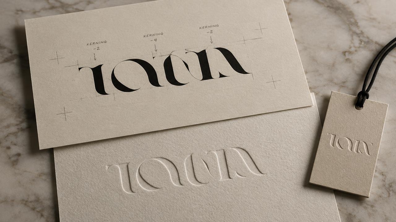
[Image: A clean, modern sans-serif wordmark for "AURA". The letterforms feature subtle, almost imperceptible curves, particularly in the 'A' and 'R', giving a soft, flowing feel. The overall weight is light, with generous tracking. A very thin, elegant abstract curve subtly underlies or integrates with the 'U' or 'R'.]

Description: This variant utilizes a custom-drawn humanist sans-serif typeface, inspired by the gentle undulations of natural forms. The slightly elongated ascenders and descenders, combined with open counters, create an airy and refined presence. The subtle abstract curve element is integrated into the baseline flow, suggesting the "ripple in water" direction. This design aims for understated elegance, conveying a sense of calm luxury while maintaining excellent legibility across various applications. It aligns with VERIDIAN's minimalist aesthetic but introduces a more fluid, youthful interpretation.

Inverse Version: [Image: The same "AURA" wordmark, but rendered in white on a dark, charcoal grey background. The abstract curve is also white, maintaining its delicate presence.]

--- Wordmark Concept 2: AURA – Sculpted Horizon

[Image: A geometric sans-serif wordmark for "AURA", with slightly wider letterforms and a more structured feel than Variant 1. The terminals are cleanly cut, and the spacing is precise. There's a subtle, almost architectural, abstract geometric element – perhaps a very fine line that cuts across the top of the 'A's or forms a delicate horizontal bar.]

Description: This concept explores a more structured, yet equally refined, geometric sans-serif approach. The typography is characterized by its precise construction and balanced proportions, offering a sense of stability and contemporary sophistication. While still minimalist, the letterforms carry a slightly bolder presence, reflecting an avant-garde edge. The symbol direction is expressed through a minimalist horizontal element, suggesting a horizon or a sculpted form, adding a distinct identity while remaining abstract and elegant. This variant presents a bolder interpretation of natural elegance, suitable for more assertive branding.

Inverse Version: [Image: The same "AURA" wordmark, rendered in white on a deep black background. The geometric element is also white, standing out sharply.]

--- Wordmark Concept 3: AURA – Whispering Script

[Image: A modern, elegant script wordmark for "AURA". It's not overly ornate, but rather a sophisticated, flowing script with moderate connectivity between letters. The lines are delicate, and there's a slight variation in stroke width, mimicking natural handwriting but in a highly stylized, refined manner. A subtle, organic curve might extend from one of the letter terminals, like the 'A' or 'R'.]

Description: This variant delves into an elegant, custom script that evokes a sense of personal touch and artisanal craftsmanship. The letterforms are connected fluidly, yet retain individual character and excellent readability. The subtle variations in stroke width add a handcrafted feel, aligning with the "natural elegance" concept but through a more expressive lens. The overall impression is one of bespoke luxury, suitable for high-touch marketing and exclusive product lines. This approach offers a distinct contrast to the parent brand's more rigid forms, introducing a softer, more intimate facet of luxury.

Inverse Version: [Image: The same "AURA" wordmark, rendered in a light grey on a deep navy background. The delicate lines and curves are preserved.]
Under the hood

Why this prompt works

This prompt is effective because it employs several targeted prompt engineering techniques, moving far beyond a simple request for logo ideas.

Firstly, role priming establishes the persona of a "brand designer." This grounds the AI in a professional context, ensuring the output is framed with industry-standard considerations rather than generic creative suggestions. The subsequent "objective" and "context" sections provide crucial background information, defining both the parent brand's established aesthetic and the sub-line's specific conceptual direction. This granular input prevents irrelevant or off-brand outputs.

Secondly, the prompt utilizes explicit constraints and structured output requirements. By detailing specific usage scenarios (product tags, packaging), desired style attributes (minimalist, refined), and typographic vibes (modern humanist sans-serif), the prompt channels the AI's creativity within precise brand guidelines. The requirement for three distinct variants, each with a primary design, rationale, and inverse version, forces a comprehensive exploration rather than superficial concepts. This structured approach ensures that the deliverable is not just creative, but also practical and ready for immediate design review, saving significant iteration time. Without these constraints, a simple request would yield much broader, less applicable results, requiring extensive manual refinement.

Model fit

Best AI models for this prompt

Midjourney

Midjourney excels at generating highly aesthetic and visually rich imagery, making it suitable for initial creative exploration of luxury wordmarks. Its ability to interpret nuanced stylistic prompts and render sophisticated typography can produce compelling visual directions. However, precise control over specific font families or intricate kerning may require multiple iterations or post-processing. See the full Midjourney hub for deeper guidance.

Flux

Flux offers strong capabilities for generating clean, vector-like graphics and abstract designs, which is beneficial for wordmark creation. Its strength lies in producing scalable and often minimalist outputs that align well with luxury branding aesthetics. While it may require careful prompt engineering to achieve specific typographic details, its output quality for refined visual concepts is consistently high. See the full Flux hub for deeper guidance.

When to use

  • When initiating wordmark exploration for a new luxury sub-brand.
  • To rapidly generate diverse typographic concepts for client review.
  • For designers seeking initial visual directions before deep dive into vector software.
  • When testing how different typographic aesthetics align with a specific brand strategy.
  • To explore wordmark variants that need to complement an existing parent brand visually.

When not to use

  • For creating final, production-ready vector logo files.
  • When existing strict brand guidelines already dictate precise typographic usage.
  • If the sub-line requires a complex pictorial mark as its primary identifier, not a wordmark.
  • For mass-market or non-luxury brands where

Get more from it

Pro tips

  • 1

    Clearly define `parent_brand_aesthetic` to guide the AI towards a complementary style, preventing disconnected results.

  • 2

    Specify `desired_typographic_vibe` with precise terms like 'geometric sans-serif' to narrow down output variations effectively.

  • 3

    Use `symbol_direction` sparingly; 'subtle organic curve' often works better than 'abstract shape' for focused outcomes.

  • 4

    Iterate on `sub_line_concept` by testing different adjectives to explore a wider range of emotional tones and associations.

  • 5

    Refine negative space requests by mentioning specific applications, ensuring legibility across various backgrounds and mediums.

  • 6

    Experiment with different prompt models like Midjourney or Flux to see which interprets luxury aesthetics more effectively for your needs.

Don't ship this

Common mistakes

  • Using overly generic terms for `desired_typographic_vibe`, leading to uninspired or predictable wordmarks.

    Fix — Be specific; try 'humanist sans-serif with open counters' or 'high-contrast transitional serif' for better direction.

  • Providing `symbol_direction` that is too complex, resulting in cluttered or un-luxury designs.

    Fix — Keep symbolic elements minimal and abstract; simple initial-based monograms or subtle geometric accents work best.

  • Expecting production-ready vector files directly from the AI output without further design work.

    Fix — Treat AI output as a strong conceptual starting point, requiring manual refinement and vectorization in design software.

  • Neglecting the `parent_brand_aesthetic` context, leading to a sub-line wordmark that feels disconnected.

    Fix — Explicitly link `sub_line_concept` to the parent brand's core values or visual language to ensure cohesion.

  • Not specifying negative space use cases, leading to inverse versions that aren't practically usable.

    Fix — Mention specific applications like 'dark packaging' or 'embroidery on black fabric' for targeted negative space designs.

People also ask

Frequently asked questions

Q.Can this prompt generate full logos with pictorial marks, not just wordmarks?

The prompt focuses on wordmarks and subtle symbolic elements. While it can integrate abstract symbols, its strength is in typographic exploration. For complex pictorial marks, a different prompt structure would be more effective.

Q.How should I phrase `desired_typographic_vibe` for the best results?

Use specific typographic terminology. Instead of 'modern,' try 'geometric sans-serif with tight kerning' or 'elegant script with high ascenders.' The more precise your description, the better the AI's interpretation will be.

Q.Is it possible to generate more than three variants?

Yes, you can modify the 'Generate three distinct wordmark variants' instruction to request more. However, for focused exploration, processing three at a time often yields better control and reviewability.

Q.Will the output include specific font names?

AI models typically generate visual styles rather than naming specific commercial fonts. The output will provide visual representations and descriptions of typographic characteristics, which you can then match to existing typefaces or custom design.

Q.Can I specify a color palette beyond monochrome?

While the prompt emphasizes monochrome for initial exploration to focus on form, you can instruct the AI to explore limited color variations. Start with a refined monochrome palette, then iterate with a specific accent color if needed.

Q.How does this prompt help ensure legibility at small sizes?

The prompt explicitly states the wordmark 'must be legible at small sizes.' The AI will generally favor simpler, clearer letterforms in its designs. You'll still need to test the outputs at actual small scales during design refinement.

Version 1.0Last reviewed July 20, 2026
Reviewed by PromptInFlow Editorial Team