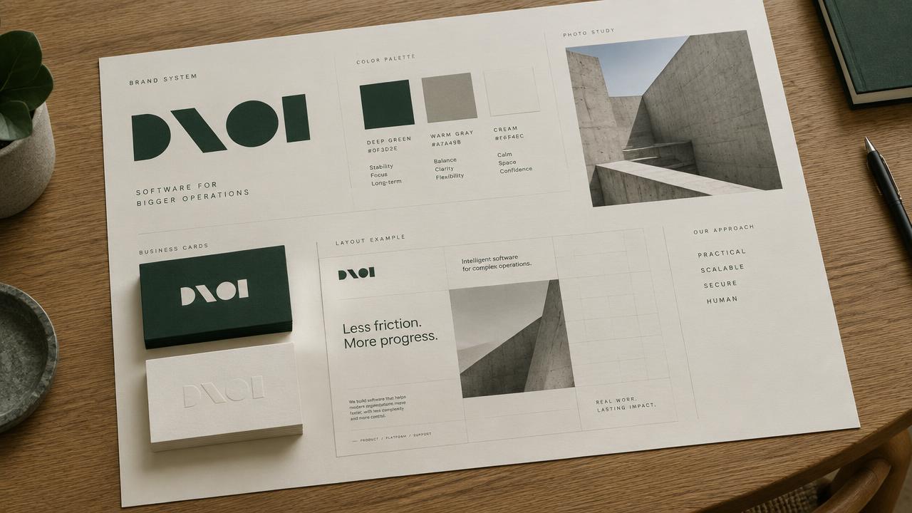
Brand Mood Specification
1. Color Palette
* Forest Green (#224D33): Evokes growth, sustainability, and reliability. Strategically chosen to communicate environmental responsibility and a grounded, trustworthy presence. * Charcoal Gray (#3A3F44): Represents sophistication, stability, and professionalism. Serves as a strong neutral base, providing a mature counterpoint to the more vibrant accents. * Deep Ochre (#C28D00): A rich, earthy yellow-brown symbolizing efficiency and the value derived from optimization. It adds warmth and a touch of understated energy, breaking from typical tech blues.
* Sky Blue (#87CEEB): Used sparingly, this light, clear blue signifies transparency and clarity in data. It offers a subtle nod to technology and open systems without dominating the palette. * Terracotta (#CD6B4B): A warm, inviting accent suggesting human connection and practical solutions. It adds a touch of approachability and a sense of tangible progress.
2. Typography Vibe
- Primary Font Style: A modern, clean sans-serif with strong legibility and a slightly geometric structure (e.g., Montserrat or Inter variant). Characteristics: professional, efficient, direct, and highly readable for data-rich interfaces. Personality: trustworthy, intelligent, and forward-thinking.
- Secondary Font Style: A humanist sans-serif with a bit more warmth and openness (e.g., Open Sans or Lato). Characteristics: approachable, friendly, and supportive. Personality: collaborative, user-centric, and clear for longer-form content or supportive text.
- Usage Notes: The primary font will anchor headlines and key UI elements, conveying authority and precision. The secondary font will provide balance, ensuring readability and a welcoming tone in body text and marketing materials. Careful pairing will emphasize hierarchy and guide the user's eye without feeling overly rigid.
3. Texture & Pattern Exploration
- Subtle Grid Overlay: A very faint, almost imperceptible grid pattern applied as an overlay or background element. It evokes order, structure, and precision in logistics, without being overtly technical. It suggests an underlying system and data organization.
- Organic Line Art (Flowing Paths): Simple, elegant line art representing interconnected paths or routes, subtly abstracting logistics networks or supply chains. These elements are fluid, not rigid, symbolizing efficient movement and interconnectedness, emphasizing environmental responsibility through natural, flowing forms.
- Gradient Noise Texture: A very subtle, soft gradient noise texture applied to backgrounds or larger graphic elements. It provides visual depth and a contemporary feel, avoiding flat digital sterility, and suggesting natural variations found in real-world systems.
4. Sample Compositions (Visual Descriptions)
- Composition 1: Dashboard Overview (Hero Section)
* A clean layout with a dominant Forest Green background. Key performance indicators are displayed using the primary sans-serif font in white or light gray, with numbers highlighted in Deep Ochre. A subtle Sky Blue line graph flows across the bottom, representing efficiency trends. The organic line art pattern is discreetly visible in the background, suggesting seamless data flow. The layout uses ample negative space around metrics for clarity and focus. * Negative Space & Contrast: Significant negative space around data points and titles ensures each piece of information is digestible. Contrast is achieved through the dark green background against light text and the vibrant Deep Ochre accents, drawing immediate attention to critical metrics.
- Composition 2: Marketing Landing Page (Feature Highlight)
* A section divided vertically: one side with a Charcoal Gray background, featuring a concise headline and description in the primary sans-serif. The other side is a clean white, displaying an abstract rendering of the 'flowing paths' organic line art in a light Forest Green or Sky Blue. A call-to-action button uses Terracotta. The overall feel is sophisticated and inviting, not overly technical. * Negative Space & Contrast: The clear division between text and graphic elements creates strong negative space, preventing visual clutter. Contrast is established by the dark gray text block against the white graphic area, and the warm Terracotta button against the cooler greens and blues, guiding user interaction.
- Composition 3: Application UI Element (Card Component)
* A card with a soft Charcoal Gray border and a clean white interior. The card title uses the primary sans-serif, while supporting details use the secondary humanist sans-serif. A small icon, rendered in Deep Ochre, indicates a specific function. The subtle grid overlay texture is visible in the card's background. Corners are slightly rounded for a modern, approachable feel. * Negative Space & Contrast: Ample padding within the card provides negative space around content, improving readability. Contrast is maintained through distinct font weights and the use of Deep Ochre for functional indicators against the neutral background, making interactive elements clear without being jarring.