Image AILogos & MarksIntermediate60 minSaves 1 hour

Fintech Logomark: Geometric Symbol Exploration

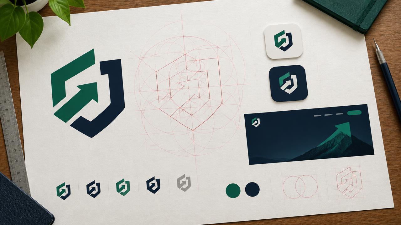
Fintech brand teams need distinct logomarks. Generate fresh geometric symbols for your product, moving beyond common 'infinity' or 'arrow' motifs to create a memorable brand identity.

This prompt helps fintech brand designers generate unique geometric logomark concepts. Focus on abstract shapes and modern aesthetics to avoid generic symbols, ensuring a distinctive visual identity for new products or rebrands. It provides structured requests for usage, style, and symbol direction.

READY-TO-USE PROMPT

Copy Prompt

prompt.txt
Role: You are a senior brand identity designer specializing in fintech, with a keen eye for abstract geometric forms and modern minimalism.

Context: Our new fintech product, focused on {{product_core_value}}, requires a distinctive and memorable logomark. We need to explore geometric symbols that convey stability, innovation, and efficiency without resorting to overused motifs like infinity loops, arrows, or literal currency symbols. The logomark should feel contemporary and sophisticated, suitable for a tech-forward financial service.

Task: Develop three unique geometric logomark concepts. Each concept must feature a primary symbol, a recommended typography vibe, and considerations for its application. Additionally, for each concept, explore how negative space can be intentionally integrated or leveraged.

Constraints:
*   **Geometric Abstraction**: Prioritize abstract geometric forms. Avoid any literal interpretations of finance (e.g., coins, charts, upward-trending graphs).
*   **Distinctiveness**: Absolutely no 'infinity' symbols, 'arrow' shapes, or overly simplistic, generic forms. The goal is originality within geometric constraints.
*   **Scalability & Clarity**: Ensure the proposed symbols would remain legible and impactful across various sizes, from a small app icon to large marketing collateral.
*   **Aesthetic Tone**: Maintain a clean, modern, and sophisticated aesthetic. Avoid overly complex or ornate designs.
*   **Output Detail**: Each concept must explicitly detail the following:
    *   **Symbol Direction**: Describe the geometric principles or specific inspirations behind the symbol (e.g., tessellations, interconnected polygons, dynamic asymmetry, impossible geometry, optical illusions).
    *   **Typography Vibe**: Suggest a specific font style or characteristic that would complement the logomark (e.g., monospaced sans-serif, geometric humanist, sharp serifs, rounded contemporary).
    *   **Usage Context**: Outline ideal applications where the logomark would shine (e.g., digital-first platforms, print collateral, animated sequences, dark mode environments).
    *   **Negative Space Exploration**: Describe how negative space is actively used or implied within the symbol to create secondary meanings, visual interest, or structural integrity.

Output:
Present three distinct logomark concepts. For each concept, provide:

1.  **Concept {{concept_number}}**: [A concise, descriptive name for the concept]
    *   **Symbol Direction**: [Detailed explanation of the geometric form, its construction, and its underlying inspiration. Focus on uniqueness.]
    *   **Typography Vibe**: [Specific characteristics of the suggested typeface, explaining why it pairs well with the symbol.]
    *   **Usage Context**: [Practical examples of where this logomark would be deployed and its effectiveness in those scenarios.]
    *   **Negative Space Exploration**: [Elaborate on the role of negative space – is it forming a secondary shape, creating depth, or enhancing visual tension?]
    *   **Visual Prompt Idea**: An example prompt snippet for an image generation model to visualize this specific logomark concept. For instance: "abstract geometric logomark, interlocking minimalist forms, subtle gradient, clean lines, for a fintech brand, contemporary, stable, no text, square format --ar 1:1 --style raw"

2.  **Concept {{concept_number}}**: [Repeat structure for the second concept]

3.  **Concept 3**: [Repeat structure for the third concept]

Estimated results

DifficultyIntermediate
Setup time60 min
Time saved1 hour
Best modelsMidjourney, Flux
Best audiencefintech

Editor's note

Why this prompt matters

Fintech brands often struggle to differentiate themselves visually in a crowded market. Many new financial products default to familiar, often generic, symbols that fail to convey true innovation or distinct identity. This challenge is particularly acute for in-house brand teams tasked with creating a logomark that is both modern and memorable, yet avoids the clichés of infinity loops or literal arrows.

This workflow is designed for brand designers and marketing strategists within fintech companies who need to rapidly explore unique geometric logomark concepts. It provides a structured approach to ideation, ensuring that generated concepts are not only aesthetically pleasing but also strategically aligned with core brand values like stability, innovation, and efficiency. By focusing on abstract geometry and specific constraints, the process steers away from predictable designs, helping teams discover fresh visual language.

Reach for this workflow when your team needs to move past initial brainstorming hurdles, especially when facing creative blocks or a tight deadline for a new product launch. It streamlines the initial design exploration phase, offering concrete directions for visual development and providing a clear brief for subsequent design iterations or discussions with external agencies.

Anatomy

Prompt engineering breakdown

Role

Senior brand identity designer specializing in fintech, with expertise in abstract geometric forms and modern minimalism.

Context

The task is to design a distinctive logomark for a new fintech product, focusing on {{product_core_value}}. The logomark must convey stability, innovation, and efficiency using contemporary geometric symbols, while strictly avoiding overused motifs like infinity loops or arrows.

Goal

To generate three unique geometric logomark concepts. Each concept must detail its primary symbol, recommended typography vibe, application considerations, and intentional integration of negative space.

Constraints

The prompt explicitly forbids literal financial interpretations, 'infinity' symbols, or 'arrow' shapes. It mandates geometric abstraction, distinctiveness, scalability, a clean modern aesthetic, and specific output details for symbol direction, typography, usage, and negative space exploration.

Output format

The output requires three distinct logomark concepts. Each concept must include a descriptive name, detailed explanations for Symbol Direction, Typography Vibe, Usage Context, Negative Space Exploration, and a specific Visual Prompt Idea for image generation.

Why this structure works

This prompt employs strong role priming by assigning the persona of a senior brand identity designer, which directs the model toward sophisticated design thinking. Explicit constraints on forbidden elements and aesthetic tone prevent generic outputs. The structured output format ensures comprehensive details for each concept, covering all necessary design considerations.

Pick your version

Prompt variations

BeginnerWorks with any model

For initial brainstorming of simple geometric logomark ideas, especially if you're new to prompt engineering or design exploration.

prompt.txt
Act as a brand designer for a new fintech product focused on {{product_core_value}}. We need three simple geometric logomark ideas. Avoid common shapes like arrows or infinity signs. Focus on clean, modern shapes that suggest stability and innovation. For each idea, describe the main shape, a suitable font style (like clean sans-serif or bold serif), and how it could be used (e.g., app icon, website). Also, think about any interesting empty spaces within the shape.
Output:
1. Concept 1: [Name]
   - Shape Idea: [Simple description]
   - Font Style: [Example]
   - Usage: [Where it fits]
   - Empty Space: [How it adds to the shape]
   - Image Prompt: 'simple geometric logomark, clean lines, modern, for a fintech brand, no text, square format --ar 1:1'
2. Concept 2: [Name]
   - Shape Idea: [Simple description]
   - Font Style: [Example]
   - Usage: [Where it fits]
   - Empty Space: [How it adds to the shape]
   - Image Prompt: 'simple geometric logomark, clean lines, modern, for a fintech brand, no text, square format --ar 1:1'
3. Concept 3: [Name]
   - Shape Idea: [Simple description]
   - Font Style: [Example]
   - Usage: [Where it fits]
   - Empty Space: [How it adds to the shape]
   - Image Prompt: 'simple geometric logomark, clean lines, modern, for a fintech brand, no text, square format --ar 1:1'
ProfessionalBest with midjourney

When detailed, structured logomark concepts are needed for a design team, requiring specific guidance on aesthetic, application, and negative space.

prompt.txt
Act as a senior brand identity designer specializing in fintech, with expertise in abstract geometric forms and modern minimalism.

Our new fintech product, focused on {{product_core_value}}, requires a distinctive and memorable logomark. The goal is to explore geometric symbols that convey stability, innovation, and efficiency, strictly avoiding overused motifs like infinity loops, arrows, or literal currency symbols. The logomark must be contemporary and sophisticated, suitable for a tech-forward financial service.

Develop three unique geometric logomark concepts. Each concept should detail a primary symbol, a recommended typography vibe, and considerations for its application. Additionally, for each concept, explore the intentional integration or use of negative space.

Ensure concepts prioritize abstract geometric forms, avoiding literal finance interpretations. Maintain distinctiveness by excluding infinity symbols, arrow shapes, or generic forms. Confirm scalability and clarity across various sizes. Adhere to a clean, modern, and sophisticated aesthetic. Each concept must explicitly detail: Symbol Direction, Typography Vibe, Usage Context, and Negative Space Exploration.
Short VersionWorks with any model

For quick, high-level inspiration or when time is limited, needing rapid geometric logomark ideas for a fintech product.

prompt.txt
Generate three distinct geometric logomark ideas for a fintech product focused on {{product_core_value}}. The logomark must be modern, convey stability and innovation, and strictly avoid infinity symbols, arrows, or literal financial imagery. For each idea, briefly describe the geometric symbol, a complementary typography style, its primary usage context, and how negative space contributes to its design. Include a concise image generation prompt for each concept, like: 'abstract geometric logomark, modern fintech, clean, no text, --ar 1:1'.
EnterpriseBest with flux

For large organizations where brand guidelines, legal compliance, and multiple stakeholder reviews are critical in the logomark design process.

prompt.txt
Act as a senior brand identity designer specializing in enterprise fintech, with a deep understanding of abstract geometric forms, brand governance, and multi-market application.

Our new enterprise fintech product, focused on {{product_core_value}}, demands a logomark that is not only distinctive and memorable but also resilient across a complex brand architecture and compliant with global regulatory standards. We need to explore geometric symbols that convey stability, innovation, and efficiency, while strictly avoiding overused motifs. The logomark must project contemporary sophistication, suitable for a tech-forward financial service operating at scale.

Develop three unique geometric logomark concepts. Each concept must feature a primary symbol, a recommended typography pairing, and detailed considerations for its application across diverse platforms, regional variations, and sub-brand integrations. Additionally, for each concept, explore how negative space is intentionally integrated, and outline potential challenges or opportunities for brand governance and legal review.

Constraints:
*   **Geometric Abstraction**: Prioritize abstract geometric forms. Avoid any literal interpretations of finance.
*   **Distinctiveness**: Absolutely no 'infinity' symbols, 'arrow' shapes, or overly simplistic, generic forms. Focus on originality within geometric constraints.
*   **Scalability & Clarity**: Ensure legibility and impact across a full spectrum of sizes, from micro-icons within a design system to large-scale environmental branding, maintaining integrity across international market adaptations.
*   **Aesthetic Tone**: Maintain a clean, modern, and sophisticated aesthetic, suitable for a global enterprise brand.
*   **Brand Governance**: Consider how each concept supports consistent application and management within a comprehensive brand guidelines framework.
*   **Output Detail**: Each concept must explicitly detail the following:
    *   **Symbol Direction**: Describe the geometric principles or specific inspirations behind the symbol.
    *   **Typography Vibe**: Suggest a specific font style or characteristic that would complement the logomark.
    *   **Usage Context**: Outline ideal applications, including considerations for multi-brand integration, co-branding scenarios, and localization requirements.
    *   **Negative Space Exploration**: Describe how negative space is actively used or implied within the symbol.

What you'll get

Expected output

Here are three distinct logomark concepts for a fintech product focused on secure data transactions:

  1. Concept 1: The Nexus Lattice

* Symbol Direction: Interconnected hexagonal lattice, forming a central, stable void. Inspired by crystal structures and secure network topologies, emphasizing interconnectedness and integrity without literal representation. The geometry suggests a system where individual elements contribute to a robust whole. * Typography Vibe: A monospaced sans-serif with subtle rounded terminals, such as "IBM Plex Mono" or a custom variant. This choice conveys precision, technical reliability, and a digital-native aesthetic, balancing the geometric rigidity of the symbol. * Usage Context: Ideal for digital interfaces, app icons, and data visualization dashboards where clarity and system integrity are paramount. Its modular nature allows for animation that highlights connection points or data flow. * Negative Space Exploration: The central hexagonal void is crucial. It represents a secure "container" or a focal point of trust, formed by the positive space of the lattice. This negative space is as significant as the lines themselves, creating a sense of containment and precision. * Visual Prompt Idea: abstract geometric logomark, interlocking hexagonal lattice, central void, minimalist, teal and dark blue, secure data transactions, fintech brand, clean lines, contemporary, stable, no text, square format --ar 1:1 --style raw

  1. Concept 2: The Ascendant Arc

* Symbol Direction: A series of three progressively larger, nested arcs, each slightly offset, creating an upward and forward motion without a literal arrow. The form suggests growth, progression, and forward-thinking, drawing inspiration from architectural arches and orbital paths. It’s dynamic yet balanced. * Typography Vibe: A geometric humanist sans-serif with open counters and a slightly wider stance, like "Museo Sans" or "Proxima Nova". This would lend a friendly yet sophisticated feel, balancing the symbol's dynamism with approachable professionalism. * Usage Context: Well-suited for marketing collateral focused on growth and customer journey, investor presentations, and product launch campaigns. The upward movement translates well into animated intros or transitions. * Negative Space Exploration: The increasing space between the arcs creates a sense of expansion and potential. The negative space defines the "path" of ascent, giving the symbol its forward momentum and implying a trajectory of success without explicit arrows. * Visual Prompt Idea: abstract geometric logomark, three nested arcs, progressive offset, upward motion, subtle gradient, minimalist, fintech brand, innovation, growth, clean, no text, square format --ar 1:1 --style raw

  1. Concept 3: The Folded Plane

* Symbol Direction: A single, continuous geometric ribbon or plane that appears to fold and twist into a three-dimensional form, creating an optical illusion of depth. It's inspired by origami and Mobius strips, symbolizing complexity simplified, continuous service, and interconnected operations. * Typography Vibe: A sharp, modern serif with strong contrast and geometric slab elements, similar to "Playfair Display" but with a more structured feel, or a custom experimental serif. This adds a touch of established credibility and sophistication, contrasting the symbol's modern abstraction. * Usage Context: Excellent for branding that emphasizes intricate backend operations, intelligent algorithms, or a seamless user experience. Its depth makes it engaging in digital environments where subtle animations can highlight its dimensionality. * Negative Space Exploration: The "folds" create pockets of negative space that define the symbol's three-dimensionality and imply hidden connections or layers of service. This interplay of positive and negative space makes the form visually intriguing and suggests depth beyond the surface. * Visual Prompt Idea: abstract geometric logomark, folded continuous plane, optical illusion, depth, minimalist, slate grey and silver, fintech brand, efficiency, complexity simplified, no text, square format --ar 1:1 --style raw
Under the hood

Why this prompt works

This workflow produces superior results compared to a single-line prompt primarily due to its structured approach and the application of several prompt engineering techniques.

Role priming is crucial here. By assigning the AI the persona of a "senior brand identity designer specializing in fintech," the model aligns its output with an expert perspective, ensuring the concepts are grounded in design principles and industry relevance, rather than generic ideas. This establishes a baseline for sophisticated output.

The detailed "Context" and "Task" sections provide a clear objective and boundaries. Explicitly stating "no 'infinity' symbols, 'arrow' shapes, or overly simplistic, generic forms" acts as negative constraint priming, guiding the model away from common pitfalls and encouraging genuine originality. This prevents the output from being diluted by clichés often found in more open-ended requests.

Furthermore, the "Output Detail" section functions as a form of structured output specification. By requiring specific sub-sections for each concept—Symbol Direction, Typography Vibe, Usage Context, and Negative Space Exploration—the prompt ensures comprehensive and actionable design briefs. This eliminates vague responses and instead delivers fully fleshed-out ideas that can directly inform design decisions. The inclusion of a "Visual Prompt Idea" further enhances this by providing a ready-to-use input for image generation models, bridging the conceptual phase with practical application. This multi-faceted approach guarantees a richer, more usable output than a simple request for "fintech logos."

Model fit

Best AI models for this prompt

Midjourney

Midjourney is known for its aesthetic quality and ability to interpret abstract concepts with high fidelity. It excels at generating visually appealing geometric patterns and handling complex negative space prompts, though sometimes it may lean towards artistic interpretations over strict corporate minimalism. See the full Midjourney hub for deeper guidance.

Flux

This model is effective for generating clean, vector-like geometric shapes and can follow specific stylistic instructions well. Its strength lies in producing crisp lines and defined forms, making it suitable for logo exploration where precision is key, though its creative interpretation of abstract concepts might be less varied than Midjourney's. See the full Flux hub for deeper guidance.

When to use

  • When initiating logomark exploration for a new fintech product and needing diverse geometric concepts.
  • To generate multiple distinct visual directions early in the brand identity design process, avoiding common financial clichés.
  • When a design team needs to quickly present several abstract geometric options to stakeholders for initial feedback.
  • For exploring how negative space can be integrated into a logomark from the outset.
  • To provide clear design briefs for external agencies or junior designers, ensuring specific stylistic parameters.

When not to use

  • If the project requires a logomark based on specific typography or a wordmark as the primary element.
  • When the design brief explicitly calls for organic, illustrative, or figurative logomarks.
  • For final production-ready logo files; this prompt generates conceptual directions, not final assets.
  • If a specific color palette or brand guidelines are already established and must be strictly followed within the prompt.

Get more from it

Pro tips

  • 1

    Refine `product_core_value` to be highly specific; this prevents generic output that lacks a distinct narrative.

  • 2

    Employ precise geometric terminology in `Symbol Direction` to guide the model toward unique forms, avoiding vague shapes.

  • 3

    Iterate on the `Visual Prompt Idea` for each concept, experimenting with modifiers to fine-tune the generated imagery. This prevents visual repetition.

  • 4

    Clearly define how negative space should function; this ensures it contributes meaningfully, not just as empty area.

  • 5

    Consider the scalability constraints early; this prevents designs that fail at small sizes like app icons.

  • 6

    Test the logomark concepts in different `Usage Contexts` mentally; this helps validate their versatility before generation.

Don't ship this

Common mistakes

  • Providing a vague `product_core_value` like 'finance solutions,' leading to uninspired concepts.

    Fix — Specify distinct attributes, e.g., 'secure micro-investments' or 'transparent cross-border payments,' to guide uniqueness.

  • Describing `Symbol Direction` with general terms such as 'a modern shape,' resulting in generic output.

    Fix — Use specific geometric language: 'interlocking planar surfaces,' 'asymmetric polyhedra,' or 'implied cubic forms.'

  • Overlooking the negative space description or making its role too generic within the concept.

    Fix — Detail its active role, e.g., 'forms a hidden 'S' in the counter-space' or 'creates dynamic tension between elements.'

  • Expecting fully rendered, production-ready vector files directly from the initial output.

    Fix — Treat the output as a conceptual guide for manual design work or further refinement in vector software.

  • Not explicitly stating what *not* to include, beyond the prompt's inherent constraints.

    Fix — Add specific negative prompts to `Visual Prompt Idea` if certain undesirable elements appear, like '--no gradients --no text.'

  • Failing to vary the `Typography Vibe` significantly enough across the three distinct concepts.

    Fix — Explore a broader range of type characteristics, from humanist sans-serifs to robust geometric slab serifs, for diverse pairing options.

People also ask

Frequently asked questions

Q.Can I use this prompt for B2B fintech products, or is it better suited for B2C?

This prompt is effective for both B2B and B2C fintech. The focus on abstract geometric forms and sophistication translates well across audiences, provided your product_core_value aligns with the B2B context.

Q.How much detail should I put into the `Symbol Direction`?

Provide enough detail to differentiate each concept. Focus on the underlying geometric principles, form construction, and any subtle visual dynamics. Aim for 2-3 sentences that clearly articulate the shape's essence.

Q.What if the generated `Visual Prompt Idea` doesn't quite match the textual description?

Refine the Visual Prompt Idea by adding or removing keywords, adjusting stylistic parameters, or incorporating negative prompts. Iteration on this specific prompt snippet is often necessary.

Q.Can I request specific colors in the prompt?

While the prompt doesn't explicitly ask for colors, you can integrate color preferences into the Visual Prompt Idea for image generation. However, the core design concepts remain color-agnostic for broader application.

Q.Is it possible to generate more than three concepts at once?

The prompt is structured for three distinct concepts to ensure depth in each. If you need more, run the prompt multiple times with different product_core_value or alternative geometric inspirations.

Q.How do I ensure the generated logomarks avoid looking generic, despite the geometric constraints?

Focus on unusual geometric principles, unexpected interactions of forms, and intelligent use of negative space. The Distinctiveness constraint is key; emphasize unique structural logic in your descriptions.

Version 1.0Last reviewed July 20, 2026
Reviewed by PromptInFlow Editorial Team