Image AIConcept ArtIntermediate5 minSaves 1 hour

SaaS Dashboard Hero Mockup: B2B Landing Page Data-Viz

For in-house B2B SaaS designers, generate high-fidelity dashboard hero mockups for landing pages, ensuring brand consistency and showcasing both empty and populated states.

Generate detailed hero section mockups for B2B SaaS landing pages, featuring clean data visualization. This prompt helps in-house designers create brand-consistent dashboard visuals, including both empty and populated states, to effectively communicate product value to potential customers.

READY-TO-USE PROMPT

Copy Prompt

prompt.txt
Role: An experienced UI/UX designer and visual architect for B2B SaaS applications, focused on creating compelling product representations.

Context:
The marketing team requires a hero section visual for a new landing page. This visual must immediately convey the core value proposition of a data-driven SaaS product. The objective is to produce two distinct versions of a dashboard mockup: one representing an "empty state" (e.g., "no data yet" or setup instructions) and another a "populated state" (displaying illustrative data). These mockups need to be highly visually appealing, strictly consistent with brand guidelines, and clearly communicate the product's analytical capabilities and user experience potential.

Task:
Formulate a comprehensive and precise image generation prompt designed to create a high-fidelity hero dashboard mockup specifically tailored for a B2B SaaS landing page. The prompt must meticulously specify all visual elements, interactive states, and stylistic parameters to guide the image model in producing accurate and relevant outputs.

Constraints:
-   **Style**: Adopt a clean, modern, and minimalist aesthetic for all data visualization elements. Avoid any skeuomorphic design principles or overly complex textures. Focus on clarity and readability.
-   **Brand Consistency**: Integrate the specified `{{brand_palette_description}}` precisely. Colors should be used functionally to distinguish data points and UI elements without overwhelming the user interface.
-   **Content Focus**: Emphasize abstract data representation. Text content should be minimal, primarily for labels, headings, or placeholder messages. Avoid generating Lorem Ipsum or generic filler text where actual data labels are expected.
-   **Required States**: The prompt must facilitate the generation of both an "empty state" dashboard (showing a new user's perspective before data input) and a "populated state" (demonstrating the system with example `{{key_dashboard_metrics}}` like "user engagement trends" or "financial performance indicators").
-   **Layout Structure**: The dashboard should feature a typical, professional layout, including a prominent main data display area, an optional but recommended left-hand navigation sidebar, and a clean top header bar. Clearly define sections for various data visualizations.
-   **Aspect Ratio**: Specify a `{{target_aspect_ratio}}` (e.g., "16:9 widescreen", "4:3 standard", "3:2 cinematic") suitable for a hero section.
-   **Exclusions**: Strictly no human figures, no complex or distracting background scenes, and no visible browser chrome or operating system elements unless explicitly requested for context. Ensure all generated UI elements are functional and appropriate for a professional B2B software interface. Avoid any elements that appear non-interactive or purely decorative without purpose.

Output Instructions:
Generate a detailed, multi-part prompt string, optimized for advanced text-to-image models. The prompt should explicitly include directives for the following:

1.  **Screen Type**: Clearly define the subject as "B2B SaaS dashboard hero section mockup for a landing page".
2.  **Overall Layout**: Describe a structured, organized dashboard layout. Include instructions for elements such as a primary data display zone, a concise left-side navigation panel (if desired), a clean top-bar header, and well-defined sub-sections for different data visualizations.
3.  **Data Visualization Style**: Mandate modern, flat, or material design principles. Charts should exhibit clean lines, subtle color gradients, and clear segmentation. Utilize common, recognizable chart types such as line graphs for trends, bar charts for comparisons, pie or donut charts for distribution, and prominent key performance indicator (KPI) cards for essential metrics.
4.  **Color Palette Integration**: Instruct the model to strictly integrate the `{{brand_palette_description}}` (e.g., "a corporate palette of deep navy, teal accents, and light grey with a vibrant yellow highlight"). Ensure colors are applied intelligently to differentiate data points and guide user attention without creating visual clutter.
5.  **Typography Standards**: Specify the use of modern, highly legible sans-serif fonts for all labels, headings, and data points, maintaining a professional and crisp appearance.
6.  **Interactive States Definition**:
    *   **Populated State**: Depict a dashboard filled with illustrative data, populating charts, graphs, and KPI cards. This should convincingly demonstrate the product's functionality and value, focusing on the `{{key_dashboard_metrics}}`.
    *   **Empty State**: Present the identical dashboard layout but with placeholder elements, "no data available" messages, clear onboarding prompts, or initial setup guidance, indicating where data will eventually appear.
7.  **Negative Prompts**: Explicitly list elements to avoid, such as blurry or unreadable text, inconsistent user interface elements, artifacts, non-functional icons, or any design flaws that detract from a professional B2B presentation.

Estimated results

DifficultyIntermediate
Setup time5 min
Time saved1 hour
Best modelsMidjourney, Flux
Best audienceSaaS, Product Design

Editor's note

Why this prompt matters

In-house design teams at B2B SaaS companies frequently need to visualize complex data applications for marketing purposes. Crafting a compelling hero section for a landing page, especially one that accurately represents a data-driven product, can be a significant undertaking. This often involves ensuring brand consistency, portraying the product's value, and illustrating both its initial state for new users and its functionality when populated with data.

This workflow is designed for UI/UX designers and marketing professionals who need to quickly generate high-fidelity, on-brand dashboard mockups. It streamlines the creation of visuals that communicate product capabilities effectively, without the lengthy iterative design process typically associated with such assets. Reach for this workflow when launching new features, refreshing landing pages, or when A/B testing different visual approaches for product representation. It helps maintain visual integrity while accelerating content production.

Anatomy

Prompt engineering breakdown

Role

An experienced UI/UX designer and visual architect for B2B SaaS applications, focused on creating compelling product representations.

Context

A marketing team needs hero section visuals for a new landing page. These visuals must immediately convey the core value proposition of a data-driven SaaS product and include both 'empty state' and 'populated state' dashboard mockups, consistent with brand guidelines.

Goal

To formulate a comprehensive and precise image generation prompt designed to create a high-fidelity hero dashboard mockup specifically tailored for a B2B SaaS landing page, meticulously specifying all visual elements, interactive states, and stylistic parameters.

Constraints

Strictly clean, modern, minimalist aesthetic; precise `{{brand_palette_description}}` integration; abstract data representation with minimal text; required 'empty state' and 'populated state'; typical professional layout (main display, navigation sidebar, top header); specific `{{target_aspect_ratio}}`; no human figures, complex backgrounds, or visible browser/OS elements.

Output format

A detailed, multi-part prompt string, optimized for advanced text-to-image models. It must explicitly include directives for screen type, overall layout, data visualization style, color palette integration, typography standards, interactive states definition, and negative prompts.

Why this structure works

The role priming establishes the model's persona as a UI/UX expert, guiding its understanding of design principles. Explicit constraints ensure adherence to specific styles, brand elements, and required interactive states. Structured output instructions break down complex visual requirements into manageable parts, leading to more accurate and comprehensive image generation.

Pick your version

Prompt variations

BeginnerWorks with any model

For new users needing a straightforward approach to generate basic dashboard mockups without complex styling parameters, focusing on core visual requirements.

prompt.txt
Create a clean, modern B2B SaaS dashboard hero image for a landing page. It needs to show both an 'empty state' (no data yet) and a 'populated state' (with sample data charts and KPIs). Use the `{{brand_palette_description}}` for all colors and ensure the layout is professional with a main data area and a left navigation. Keep typography simple and readable. The aspect ratio should be `{{target_aspect_ratio}}`. Avoid people, busy backgrounds, or browser frames. Focus on abstract data visualizations like line graphs and bar charts with clear labels.
ProfessionalBest with midjourney

When detailed control over UI elements, data visualization types, and brand adherence is critical for a production-ready asset, requiring precise visual specifications.

prompt.txt
As a UI/UX design specialist, generate an image prompt for a B2B SaaS dashboard hero section, specifically for a landing page. The output must feature two states: a 'populated state' demonstrating key `{{key_dashboard_metrics}}` via modern data visualizations (line, bar, donut charts, KPI cards) and an 'empty state' showing onboarding or 'no data' messages within the same structural layout. Strictly adhere to the `{{brand_palette_description}}` for all UI elements and data points. The layout requires a prominent main display, a concise left navigation, and a clean top header. Typography must be professional sans-serif. Specify `{{target_aspect_ratio}}`. Exclude all human figures, external browser elements, or distracting background noise. Emphasize clarity and functional aesthetics.
Short VersionBest with flux

For quick iterations or when working with models that respond better to concise, direct instructions, suitable for rapid prototyping and initial concept generation.

prompt.txt
Generate a high-fidelity image prompt for a B2B SaaS dashboard hero mockup, suitable for a landing page, presenting both an 'empty state' and a 'populated state' with illustrative data. Incorporate `{{brand_palette_description}}` and a modern, minimalist data-viz style using common charts and KPI cards. The layout should include a main display and a left navigation. Ensure professional sans-serif typography and a `{{target_aspect_ratio}}`. Exclude humans, browser elements, or any cluttered backgrounds, focusing solely on a clean, functional UI representation of `{{key_dashboard_metrics}}`.
EnterpriseBest with midjourney

For large organizations where brand governance, accessibility, and stakeholder review processes require explicit mention in the prompt's context or constraints, ensuring broader compliance.

prompt.txt
Develop a detailed image generation prompt for a B2B SaaS dashboard hero mockup, targeting a corporate landing page. This prompt must ensure strict adherence to `{{brand_palette_description}}` and corporate design governance for consistency across all visual assets. Generate two versions: an 'empty state' with clear onboarding guidance and a 'populated state' showcasing `{{key_dashboard_metrics}}` using accessible, clean data visualizations (e.g., line, bar, pie charts, KPI cards). The layout must be standard B2B UI, including a main content area, a left sidebar, and a top navigation. All text must be highly legible sans-serif, meeting accessibility standards. Specify `{{target_aspect_ratio}}`. Crucially, avoid any elements that could be misinterpreted, such as ambiguous icons, blurry text, or non-brand-compliant colors. No human figures or external UI chrome.

What you'll get

Expected output

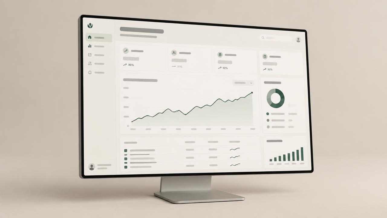
B2B SaaS dashboard hero section mockup for a landing page, 16:9 widescreen aspect ratio.

Overall Layout: Structured, organized dashboard layout featuring a prominent primary data display zone, a concise left-side navigation panel with minimalist icons and text labels, and a clean top-bar header containing a logo placeholder and simple user controls. Sub-sections for different data visualizations are clearly defined, using subtle dividers and card-like containers.

Data Visualization Style: Modern, flat design principles. Charts and graphs exhibit clean lines, subtle color gradients, and clear segmentation. Utilize common, recognizable chart types: line graphs for trends (e.g., monthly recurring revenue, active user count over time), bar charts for comparisons (e.g., feature adoption rates), donut charts for distribution (e.g., customer churn reasons), and prominent key performance indicator (KPI) cards with large, legible numbers for essential metrics.

Color Palette Integration: Strictly integrate a corporate palette of deep navy for backgrounds and primary elements, muted sky blue for secondary elements and subtle accents, and crisp white for main content areas and text. Utilize vibrant orange highlights intelligently to differentiate key data points, calls to action, and guide user attention, ensuring clarity without visual clutter.

Typography Standards: Use modern, highly legible sans-serif fonts throughout all labels, headings, and data points. Maintain a professional, crisp appearance with appropriate weight and size hierarchy.

Interactive States Definition: Populated State: Depict a dashboard filled with illustrative data. Charts, graphs, and KPI cards are fully populated with example data representing monthly recurring revenue trends, current customer churn rate, active user count growth, and feature adoption trends. Data points are clearly visible and logically arranged to demonstrate product functionality and value. Empty State: Present the identical dashboard layout but with placeholder elements. Display 'no data available' messages, clear onboarding prompts like 'Connect your data source' or 'Set up your first project', and initial setup guidance within the main data display zone, indicating where data will eventually appear.

Negative Prompts: Avoid blurry text, unreadable labels, inconsistent UI elements, visual artifacts, non-functional or decorative icons, skeuomorphic design, complex textures, human figures, distracting backgrounds, visible browser chrome, or operating system elements. Ensure all UI elements appear functional and professional.
Under the hood

Why this prompt works

The effectiveness of this workflow stems from its structured approach, moving beyond vague one-liner prompts to provide precise guidance to the language model. Role priming establishes the persona of an experienced UI/UX designer, ensuring the generated output aligns with professional design standards and terminology. This immediately directs the model's focus to the specific domain.

The inclusion of explicit constraints for style, brand consistency, content, and required states is critical. By detailing what to include (e.g., modern data-viz, specific layout elements) and, importantly, what to exclude (e.g., human figures, browser chrome), the prompt significantly reduces ambiguity and the likelihood of irrelevant or off-brand outputs. This is further reinforced by the use of negative prompts, which directly tell the image model what *not* to generate, refining the visual outcome.

Finally, the structured output instructions guide the model to produce a detailed, multi-part image generation prompt. This ensures that all necessary parameters—from screen type and layout to interactive states and typography—are explicitly covered. This level of granularity, combined with the use of variable placeholders for brand palette and key metrics, makes the resulting image prompt highly customizable and repeatable, yielding precise, high-fidelity mockups that are difficult to achieve with less prescriptive inputs.

Model fit

Best AI models for this prompt

Midjourney

Midjourney excels at generating highly aesthetic and detailed UI elements, making it suitable for polished hero mockups. Its ability to interpret complex stylistic instructions, including specific color palettes and design moods, allows for fine-tuned brand representation. However, achieving precise data visualization layouts can require multiple iterations and careful prompt engineering. See the full Midjourney hub for deeper guidance.

Flux

Flux offers strong capabilities in structuring visual compositions and handling multiple elements within a defined space, which is beneficial for dashboard layouts. It provides good control over component placement and overall scene construction, aiding in the creation of organized UI mockups. Its main limitation is sometimes requiring more explicit detail for intricate data-viz patterns compared to its strength in overall layout. See the full Flux hub for deeper guidance.

When to use

  • For B2B SaaS marketing teams needing professional hero section visuals for landing pages.
  • When designers require quick mockups of dashboard concepts, including both empty and populated states.
  • To rapidly prototype visual ideas for A/B testing or stakeholder presentations without full design software.
  • When strict adherence to a specific brand color palette and modern data-viz aesthetic is essential.
  • For content creators looking to generate visual assets that clearly communicate a product's analytical capabilities.
  • When needing to visualize a product's user experience potential through clear, data-driven interfaces.

When not to use

  • If a fully interactive, clickable prototype is the primary requirement.
  • For generating pixel-perfect, production-ready UI assets that require exact component specifications.
  • When the design demands highly experimental or non-standard UI elements outside typical B2B SaaS conventions.
  • If the project requires complex user flows or animations that cannot be conveyed in a static image.
  • When the objective is to create abstract art or non-functional graphical elements, rather than UI.

Get more from it

Pro tips

  • 1

    Refine `{{brand_palette_description}}` with specific hex codes or color names to prevent color interpretation errors and ensure precise brand alignment.

  • 2

    Provide concrete examples for `{{key_dashboard_metrics}}` like "monthly recurring revenue" or "customer churn rate" to guide data visualization relevance and accuracy.

  • 3

    Explicitly list preferred chart types, such as "line graph for trends" and "bar chart for comparisons," to avoid generic or inappropriate data representations.

  • 4

    Test various `{{target_aspect_ratio}}` values to find the best fit for your specific landing page layout, preventing awkward cropping or scaling.

  • 5

    Continuously update negative prompts with observations from prior generations, like "blurry text" or "misaligned elements," to improve output quality over time.

  • 6

    Add details about desired font weights, such as "sans-serif, light for labels, bold for KPIs," to enhance visual hierarchy and readability in mockups.

  • 7

    Describe specific placeholder elements or messages for the empty state, such as "Click here to add data" or a simple setup wizard, preventing vague "no data" screens.

Don't ship this

Common mistakes

  • Vague `{{brand_palette_description}}` leads to inconsistent or off-brand colors in the generated mockups.

    Fix — Provide specific color names, hex codes, or a concise description of primary, secondary, and accent colors to guide the model precisely.

  • Generic `{{key_dashboard_metrics}}` result in unconvincing or irrelevant data visualizations that do not reflect product value.

    Fix — Detail specific, industry-relevant metrics (e.g., "daily active users," "conversion funnel stages") to ensure meaningful data representation.

  • Omitting specific chart types causes the model to generate a mix of less effective or unsuitable data visualizations.

    Fix — Explicitly request common B2B charts like line graphs, bar charts, and KPI cards to maintain a professional, data-focused aesthetic.

  • Forgetting to define the empty state clearly leads to a blank screen or a poorly designed "no data" message.

    Fix — Instruct the model to include onboarding prompts, setup instructions, or clear calls to action within the empty state.

  • Not iterating on negative prompts allows recurring visual artifacts or undesirable elements to persist across generations.

    Fix — Analyze outputs for common errors and add new, specific negative prompts (e.g., "--no distorted text --no disproportionate icons") to refine results.

  • Providing an aspect ratio that does not suit the intended landing page section requires extensive post-generation cropping.

    Fix — Experiment with common web design aspect ratios like 16:9 or 21:9 to find the optimal fit before final generation.

  • Overly complex data visualization requests cause the model to struggle with clarity and generate cluttered UIs.

    Fix — Keep data viz instructions focused on clean, minimalist design principles, prioritizing readability and functional aesthetics over elaborate graphics.

People also ask

Frequently asked questions

Q.Can this prompt generate mockups for mobile dashboards?

While designed for desktop, you can specify "mobile dashboard hero section" in the Screen Type and adjust Overall Layout and Aspect Ratio for mobile-first designs. Additional negative prompts for desktop elements may be needed to refine the output.

Q.How specific should the `{{brand_palette_description}}` be?

The more specific, the better. Describe primary, secondary, and accent colors using names (e.g., "ocean blue," "forest green") or hex codes if the model supports that level of detail. This ensures brand fidelity and reduces color variation.

Q.Will the generated text be readable and accurate?

Text readability is a common challenge with current image models. While the prompt asks for legible sans-serif fonts and minimal text, be prepared for some text distortions or placeholder glyphs. Post-processing for text accuracy is often required.

Q.Can I request specific chart types like heatmaps or scatter plots?

Yes, you can explicitly list "heatmap for correlation" or "scatter plot for data distribution" in the Data Visualization Style section. Stick to common, well-defined chart types for better results, but experimentation with specific types is possible.

Q.What if the empty state looks too generic?

Refine the Empty State instructions. Specify elements like "a 'Get Started' button," "three onboarding steps," or "an illustrative icon representing data input" to make it more purposeful and less generic and enhance user guidance.

Q.Is this prompt suitable for generating full, multi-page application mockups?

No, this prompt is optimized for a single "hero section" visual, focusing on a specific screen and context. For multi-page mockups, you would need to run the prompt multiple times with different layout and content directives for each screen.

Q.How do I ensure the generated mockups match my exact design system components?

The prompt guides stylistic consistency and general UI elements. For precise component matching, you would need to describe each component (e.g., "minimalist button style with rounded corners, specific shadow") in extreme detail, which can be challenging for current image models. Focus on overall aesthetic coherence.

Version 1.0Last reviewed July 23, 2026
Reviewed by PromptInFlow Editorial Team