Image AIConcept ArtIntermediate60 minSaves 1 hour

Design Mobile App Onboarding Screens with Progressive Disclosure

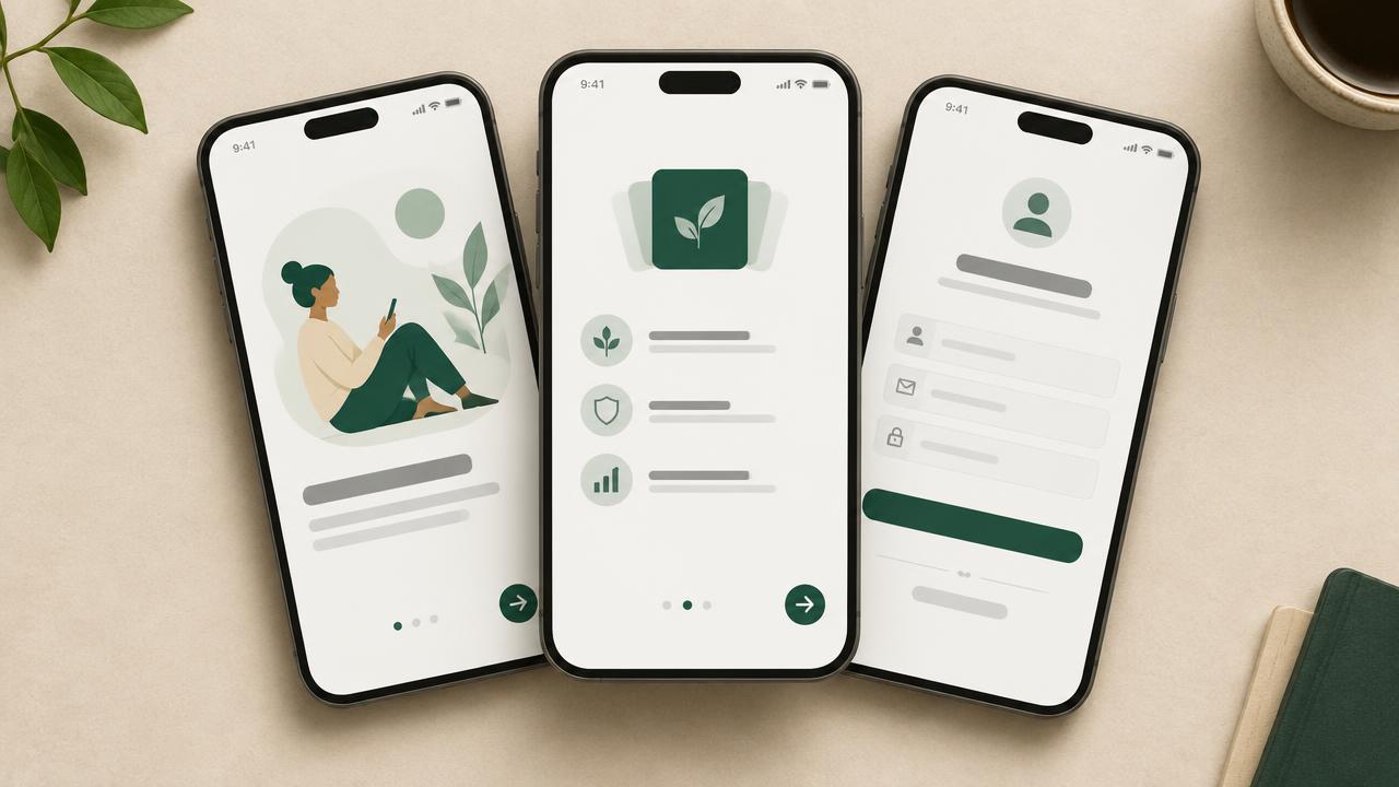
Product designers can generate a three-screen mobile app onboarding sequence. Include friendly illustrations and a consistent brand palette to improve user adoption and accelerate design cycles.

This prompt helps product designers create a three-screen mobile app onboarding sequence. It focuses on progressive disclosure, friendly illustrations, and a consistent brand palette, delivering a cohesive user experience. Generate mockups that are UI-fluent and brand-consistent, accelerating your design workflow.

READY-TO-USE PROMPT

Copy Prompt

prompt.txt
Role: Product Designer / UI/UX Designer

Context: Designing a mobile application onboarding experience for an app focused on `{{app_core_value}}`. The goal is to introduce users to key features progressively across three screens, maintaining a consistent brand identity and friendly aesthetic.

Task: Generate three distinct mobile app onboarding screens. Each screen should demonstrate progressive disclosure, feature friendly, illustrative elements, and adhere to a specified brand color palette. Focus on the visual layout, typography, and interactive states for each screen.

Constraints:
- Three distinct screens for a single onboarding flow.
- Progressive disclosure: Each screen reveals a new piece of information or feature.
- Friendly, illustrative style for visual elements. No realistic photos.
- Adhere strictly to the provided `{{brand_color_palette}}`.
- Include a clear call-to-action (CTA) on each screen.
- Avoid complex animations; focus on static screen mockups.
- Output format must clearly delineate each screen and its specifications.

Output:
For each of the three screens, provide the following details:

### Screen 1: Welcome & Core Benefit
- **Screen Type:** Introduction / Primary Value Proposition
- **Layout Description:** Describe the arrangement of elements (e.g., hero illustration, headline, brief text, CTA).
- **Illustrative Elements:** Specific objects or concepts to depict in a friendly style.
- **Typography:** Font styles, sizes, and weights for headline, body, and CTA.
- **Color Usage:** How `{{brand_color_palette}}` is applied to background, text, illustrations, and CTA.
- **Interactive States:** Describe the primary CTA (e.g., "Get Started" button in its default and pressed states).
- **Negative Space:** How whitespace is used for clarity.

### Screen 2: Key Feature Highlight
- **Screen Type:** Feature Introduction / Benefit Elaboration
- **Layout Description:** How a specific feature is introduced visually.
- **Illustrative Elements:** Visual representation of the feature.
- **Typography:** Consistent with Screen 1, but adapted for feature description.
- **Color Usage:** Consistent application of `{{brand_color_palette}}`.
- **Interactive States:** Secondary CTA (e.g., "Learn More" or "Next" button).
- **Negative Space:** Role in guiding user focus.

### Screen 3: Call to Action / Setup
- **Screen Type:** Final Action / Onboarding Completion
- **Layout Description:** Layout prompting the user to complete a setup or proceed to the app.
- **Illustrative Elements:** Encouraging or completion-oriented visual.
- **Typography:** Final call to action prominence.
- **Color Usage:** Reinforcement of brand identity.
- **Interactive States:** Primary CTA (e.g., "Start Using App" or "Create Account").
- **Negative Space:** To emphasize the final action.

Estimated results

DifficultyIntermediate
Setup time60 min
Time saved1 hour
Best modelsMidjourney, Flux
Best audienceSoftware, Product Design

Editor's note

Why this prompt matters

Designing effective mobile app onboarding sequences is a critical task for product designers, directly impacting user retention and satisfaction. Crafting a flow that introduces an app's core value and features without overwhelming new users requires careful consideration of information hierarchy, visual appeal, and brand consistency. Iterating through different visual styles and content arrangements can consume significant design time, often leading to delays in the initial product development phase.

This workflow addresses the challenge of rapidly prototyping and visualizing a three-screen onboarding experience. It's built for product designers who need to quickly generate initial concepts that adhere to specific brand guidelines and visual styles. By defining key elements like progressive disclosure and illustrative aesthetics upfront, designers can accelerate the ideation process, ensuring that the visual direction aligns with user experience goals from the outset. This is particularly useful when exploring different approaches to feature introduction or validating a specific brand palette's suitability for an introductory sequence.

Anatomy

Prompt engineering breakdown

Role

Product Designer / UI/UX Designer

Context

Designing a mobile application onboarding experience for an app focused on `{{app_core_value}}`. The goal is to introduce users to key features progressively across three screens, maintaining a consistent brand identity and friendly aesthetic.

Goal

Generate three distinct mobile app onboarding screens. Each screen should demonstrate progressive disclosure, feature friendly, illustrative elements, and adhere to a specified brand color palette. Focus on the visual layout, typography, and interactive states for each screen.

Constraints

Three distinct screens for a single onboarding flow. Progressive disclosure: Each screen reveals a new piece of information or feature. Friendly, illustrative style for visual elements. No realistic photos. Adhere strictly to the provided `{{brand_color_palette}}`. Include a clear call-to-action (CTA) on each screen. Avoid complex animations; focus on static screen mockups. Output format must clearly delineate each screen and its specifications.

Output format

For each of the three screens, provide the following details: Screen Type, Layout Description, Illustrative Elements, Typography, Color Usage, Interactive States, Negative Space.

Why this structure works

This prompt uses role priming to establish the AI as a Product Designer, setting expectations for UI/UX-specific language and considerations. Explicit constraints like 'no realistic photos' and 'adhere strictly' guide the output's style and content. The structured output format, detailing specific requirements for each screen and its elements, ensures comprehensive and consistent results, making the generated descriptions directly usable for mockup creation.

Pick your version

Prompt variations

BeginnerBest with midjourney

When you need basic ideas for app onboarding screens and are new to prompt engineering.

prompt.txt
Imagine you are a UI designer. Create ideas for three simple onboarding screens for a mobile app about `{{app_topic}}`. Each screen should show a new step. Use a friendly, cartoon-like style and only the colors from `{{brand_colors}}`. For each screen, tell me about its layout, what pictures to use, text styles, and button actions. Focus on making it easy to understand and visually appealing.
ProfessionalBest with midjourney

When you require detailed, production-ready specifications for mobile app onboarding screens, maintaining brand consistency.

prompt.txt
Role: Product Designer / UI/UX Designer. Context: Design a mobile application onboarding experience for an app focused on `{{app_core_value}}`. The goal is to introduce users to key features progressively across three screens, maintaining a consistent brand identity and friendly aesthetic. Task: Generate three distinct mobile app onboarding screens. Each screen should demonstrate progressive disclosure, feature friendly, illustrative elements, and adhere to a specified brand color palette. Focus on the visual layout, typography, and interactive states for each screen. Constraints: Three distinct screens for a single onboarding flow. Progressive disclosure: Each screen reveals a new piece of information or feature. Friendly, illustrative style for visual elements. No realistic photos. Adhere strictly to the provided `{{brand_color_palette}}`. Include a clear call-to-action (CTA) on each screen. Avoid complex animations; focus on static screen mockups. Output format must clearly delineate each screen and its specifications. Output: For each of the three screens, provide the following details: Screen Type, Layout Description, Illustrative Elements, Typography, Color Usage, Interactive States, Negative Space.
Short VersionWorks with any model

For quick ideation or when you need a concise overview of onboarding screen concepts without deep detail.

prompt.txt
As a UI designer, generate descriptions for three mobile app onboarding screens for an app about `{{app_function}}`. Each screen should progressively introduce a feature, use friendly illustrations, and follow the `{{brand_palette}}`. Detail the layout, key visual elements, typography, and calls to action for each, ensuring progressive disclosure and a consistent, clean aesthetic suitable for mockup generation.
EnterpriseBest with flux

For projects requiring adherence to corporate guidelines, accessibility standards, and stakeholder review processes, ensuring comprehensive design documentation.

prompt.txt
Role: Senior Product Designer. Context: Develop a critical mobile application onboarding flow for an enterprise solution focused on `{{enterprise_solution_goal}}`. The objective is to ensure user adoption, compliance with brand guidelines, and accessibility standards across three distinct screens, utilizing progressive disclosure. Task: Generate detailed specifications for three mobile app onboarding screens, emphasizing clarity, brand consistency, and user experience. Each screen must include illustrative elements, adhere to the `{{brand_style_guide}}` (including color palette and typography), and support clear interactive states, while considering potential stakeholder feedback and accessibility requirements. Constraints: Three screens, progressive disclosure, no photographic elements, strict `{{brand_palette}}` and `{{typography_guidelines}}`, clear CTAs, static mockups. Output must facilitate stakeholder review, address accessibility (WCAG) considerations, and include details on layout, illustrative concepts, typography, color application, interactive states, and negative space, structured for auditability and compliance checks.

What you'll get

Expected output

For this example, the app's core value is "personalized financial planning" and the brand color palette is "#4A90E2 (primary blue), #7ED321 (accent green), #F8E71C (secondary yellow), #FFFFFF (background), #333333 (text)".

Screen 1: Welcome & Core Benefit

  • Screen Type: Introduction / Primary Value Proposition
  • Layout Description: A large, friendly illustration is centered at the top, followed by a bold headline, a concise paragraph explaining the app's main benefit, and a prominent "Get Started" button at the bottom.
  • Illustrative Elements: A stylized piggy bank with leaves growing out of it, symbolizing growth and savings, set against a subtle gradient background.
  • Typography: Headline: "Inter Bold 32pt" for impact. Body text: "Inter Regular 16pt" for readability. CTA: "Inter Medium 18pt" within the button.
  • Color Usage: Background: #FFFFFF. Headline and body text: #333333. Illustration uses #7ED321 for leaves, #F8E71C for coin details, #4A90E2 for the piggy bank. CTA button background: #4A90E2 with white text.
  • Interactive States: "Get Started" button: Default state is a solid #4A90E2 background with white text. Pressed state shows a slight darkening of the blue to #3A7BCF.
  • Negative Space: Ample whitespace surrounds the illustration and text block, providing visual breathing room and drawing focus to the core message and CTA.

Screen 2: Key Feature Highlight

  • Screen Type: Feature Introduction / Benefit Elaboration
  • Layout Description: A smaller, focused illustration is placed on the left, aligned with a feature headline and descriptive text on the right. A "Next" button is positioned at the bottom.
  • Illustrative Elements: A simple line-art graph showing an upward trend, paired with a magnifying glass icon, representing financial tracking and insights.
  • Typography: Headline: "Inter SemiBold 24pt" for feature name. Description: "Inter Regular 15pt." CTA: "Inter Medium 18pt."
  • Color Usage: Background: #FFFFFF. Text: #333333. Illustration uses #7ED321 for the trend line, #4A90E2 for the magnifying glass outline. CTA button background: #4A90E2 with white text.
  • Interactive States: "Next" button: Default state is a solid #4A90E2 background with white text. Pressed state shows a slight darkening of the blue to #3A7BCF.
  • Negative Space: Balanced whitespace around the feature block ensures the content is digestible, preventing visual clutter and guiding the user's eye from the illustration to the text.

Screen 3: Call to Action / Setup

  • Screen Type: Final Action / Onboarding Completion
  • Layout Description: A celebratory illustration is at the top, followed by a concise encouragement message, and a prominent "Start Your Journey" button taking up most of the bottom third of the screen.
  • Illustrative Elements: A stylized illustration of a hand holding a smartphone with a checkmark, surrounded by subtle confetti, signifying completion and readiness.
  • Typography: Headline: "Inter Bold 28pt." Body text: "Inter Regular 16pt." CTA: "Inter Medium 20pt" for maximum prominence.
  • Color Usage: Background: #FFFFFF. Headline and body text: #333333. Illustration elements use #7ED321 for the checkmark, #4A90E2 for the phone, and #F8E71C for confetti accents. CTA button background: #7ED321 with white text.
  • Interactive States: "Start Your Journey" button: Default state is a solid #7ED321 background with white text. Pressed state shows a slight darkening of the green to #6BBF1A.
  • Negative Space: Generous negative space around the final CTA emphasizes its importance, making it the clear next step for the user.

Under the hood

Why this prompt works

This workflow achieves precise design outputs by employing several prompt engineering techniques. Role priming the model as a "Product Designer / UI/UX Designer" is fundamental; it grounds the AI in the specific vocabulary and priorities of a UX professional, ensuring the generated descriptions align with industry standards rather than generic visual concepts. This contextual setup influences the model's understanding of terms like "progressive disclosure" and "interactive states."

The explicit constraints are crucial for narrowing the creative scope. Specifying "three distinct screens," "friendly, illustrative style," and strict adherence to a "brand color palette" directly prevents the model from diverging into irrelevant or inconsistent designs. These guardrails ensure that the output is not only creative but also highly relevant and usable for a specific design task. Without these, the model might produce a single, unfocused image or a sequence lacking coherence.

Finally, the highly structured output format for each screen is key. By demanding specific details for "Screen Type," "Layout Description," "Illustrative Elements," "Typography," "Color Usage," "Interactive States," and "Negative Space," the prompt compels the model to provide a comprehensive breakdown of each design element. This structured approach forces a granular consideration of the design, yielding detailed, actionable descriptions that are far more useful for design implementation or iterative feedback than a single, high-level paragraph. It systematically builds out the entire user experience.
Model fit

Best AI models for this prompt

Midjourney

Midjourney excels at generating high-quality illustrative concepts and detailed UI elements, making it suitable for capturing the friendly, illustrative style required. Its ability to interpret complex aesthetic instructions helps maintain brand consistency across screens. However, achieving precise typography and interactive state descriptions can sometimes require iterative prompting to refine details. See the full Midjourney hub for deeper guidance.

Flux

Flux offers strong capabilities in generating UI mockups with specific layout and color palette adherence. Its strength lies in translating structured input into clean, functional designs, which is beneficial for ensuring progressive disclosure and consistent branding. While good with layout, Flux may require more explicit direction for the "friendly illustration" style compared to Midjourney. See the full Flux hub for deeper guidance.

When to use

  • When you need rapid visual concepts for an app's first-time user experience.
  • When exploring different progressive disclosure strategies across a multi-screen flow.
  • When visualizing how a specific brand color palette applies to UI elements and illustrations.
  • When generating mockups for early stakeholder reviews without high-fidelity design tools.
  • When validating initial design hypotheses about user flow and visual style.
  • When iterating quickly on onboarding screen layouts and content hierarchy.

When not to use

  • When you require pixel-perfect, interactive prototypes for comprehensive user testing.
  • When the design must incorporate complex animations or detailed micro-interactions.
  • When generating a comprehensive UI component library or design system specifications.
  • When the onboarding flow involves advanced conditional logic, branching, or user input forms.
  • When aiming for photorealistic renders or complex 3D models in your illustrations.

Get more from it

Pro tips

  • 1

    Define your `app_core_value` concisely to guide the AI's thematic understanding, preventing generic or off-topic content.

  • 2

    Specify exact hex codes or common color names for the `brand_color_palette` to ensure visual consistency and avoid color misinterpretations.

  • 3

    Clearly articulate the purpose of each screen's progressive disclosure to maintain a logical user flow and prevent disjointed experiences.

  • 4

    Detail the desired illustrative style, e.g., 'minimalist line art' or 'soft watercolor,' for better visual alignment and consistent art direction.

  • 5

    Request specific CTA text and states (e.g., 'default, pressed') for each button to receive actionable UI details and prevent vague interaction descriptions.

  • 6

    Describe negative space intentionally, such as 'generous whitespace around CTA,' to improve readability and focus, preventing cluttered layouts.

  • 7

    Iterate on the prompt, refining descriptions after reviewing initial outputs, to gradually converge on the desired aesthetic and functionality.

Don't ship this

Common mistakes

  • Providing an overly complex `app_core_value` that dilutes the AI's focus and leads to unfocused outputs.

    Fix — Simplify to a single, clear benefit, like 'Task Management' or 'Budget Tracking,' for better conceptual alignment.

  • Using vague color descriptions, which results in inconsistent or incorrect palette application across screens.

    Fix — Supply specific hex codes or well-known color names (e.g., '#FF6347, #ADD8E6') for precise brand adherence.

  • Not clearly distinguishing the progressive information or feature introduced on each consecutive screen.

    Fix — Outline what new piece of information or feature each screen introduces to ensure a logical and progressive flow.

  • Requesting 'friendly illustrations' without further defining the specific visual style or characteristics.

    Fix — Add descriptive adjectives like 'geometric,' 'hand-drawn,' or 'cartoonish' to guide the visual output more precisely.

  • Omitting details about typography beyond general terms like 'modern' or 'clean,' leading to generic font choices.

    Fix — Specify font pairings, weights (e.g., 'Inter Bold for headlines, Regular for body') for a more refined look.

  • Forgetting to mention the exact text for each Call to Action (CTA) button, leaving them undefined.

    Fix — Provide exact CTA button labels (e.g., 'Next,' 'Get Started,' 'Create Account') for direct and actionable use.

People also ask

Frequently asked questions

Q.Can I use this prompt for a B2B application's onboarding flow?

Yes, but adjust the app_core_value and illustrative style to suit a professional tone. Focus on clarity and efficiency in your descriptions, rather than overly 'friendly' elements, if that fits your brand and audience.

Q.How long should the `brand_color_palette` input be for optimal results?

Keep it concise. A list of 3-5 key colors with their names or hex codes is usually sufficient. Overly long lists can dilute the brand identity or be difficult for the AI to interpret consistently.

Q.Will this prompt generate actual UI code or exportable design assets?

No, this prompt is for generating visual concepts and descriptive specifications. The output is text-based descriptions of screens, not functional code or image files directly usable in development tools.

Q.What if I need more than three onboarding screens for my application?

You will need to run the prompt multiple times, adjusting the 'Screen Type' and 'Layout Description' for subsequent screens. The current structure is optimized for a concise, three-step flow.

Q.Can I specify different illustration styles for each of the three screens?

While technically possible, it is generally not recommended for onboarding flows, as visual consistency is key for user comfort. If you must, explicitly detail the style per screen, but be aware it might break visual flow.

Q.How detailed should the 'Interactive States' descriptions be for each CTA?

Focus on primary states like default, hover, or pressed for CTAs. Avoid extensive descriptions of complex micro-interactions, as the AI is generating static screen mockups, not animated prototypes.

Version 1.0Last reviewed July 23, 2026
Reviewed by PromptInFlow Editorial Team