Image AIBrandingAdvanced90 minSaves 2+ hours

Crafting a Specialty Coffee House Brand Mood Board

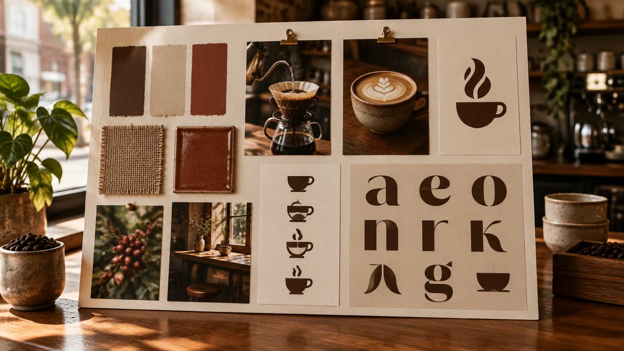
For cafe founders and brand designers, define the aesthetic of a specialty coffee house with an earth-tone palette, humanist serif, and hand-marked textures.

This prompt helps brand designers and cafe founders generate a detailed brand mood specification for a specialty coffee house. It covers visual elements like color palettes, typography, and textures, along with sample compositions and negative prompts, ensuring a cohesive and unique brand identity.

READY-TO-USE PROMPT

Copy Prompt

prompt.txt
Role: Brand Identity Architect

Context:
The objective is to establish a distinct visual identity for a specialty coffee house. This identity should evoke warmth, craftsmanship, and approachability. The core aesthetic relies on an earth-tone color palette, humanist serif typography, and the incorporation of tactile, hand-marked ephemera. This specification will guide subsequent visual asset creation, ensuring consistency across all brand touchpoints.

Task:
Develop a comprehensive brand mood specification. This document must define the visual parameters and provide specific image generation prompts (both positive and negative) that capture the desired atmosphere and style for the coffee house. Focus on translating abstract brand values into concrete visual directives.

Constraints:
1.  **Color Palette:** Predominantly earth tones. Think warm neutrals, muted greens, terracotta, soft charcoals, and creamy off-whites. Avoid vibrant, artificial, or overly cool colors.
2.  **Typography Vibe:** Emphasize humanist serif fonts. The typography should convey authenticity, tradition, and a handcrafted feel while maintaining excellent legibility. It should feel inviting and grounded, not overly formal or modern minimalist.
3.  **Textures & Materials:** Integrate natural, tactile elements. Consider materials such as handmade paper, unbleached linen, raw or lightly distressed wood, matte ceramics, and natural fibers. Subtle hand-marked illustrations, watermarks, or textural overlays are encouraged. Avoid synthetic, glossy, or highly reflective surfaces.
4.  **Imagery Style:** Visuals should feature soft, natural lighting, often with a slight warmth. Focus on close-ups of artisanal details, inviting human interactions (e.g., hands crafting coffee), and comfortable, well-lit spaces. The overall mood should be calm, authentic, and appealing. Exclude stark, high-contrast, or overly saturated imagery.
5.  **Output Format:** The final output must clearly delineate the brand mood specification followed by three distinct sample compositions, each with specific positive and negative image generation prompts.

Output:

**Brand Mood Specification:**

*   **Color Palette:**
    *   Primary: [List 2-3 primary color names/hex codes, e.g., Terracotta (#E27D60), Sage Green (#A9B388), Warm Beige (#F5E8C7)]
    *   Secondary: [List 2-3 secondary color names/hex codes, e.g., Charcoal Grey (#36454F), Cream (#FDF7E4), Muted Ochre (#C2B280)]
*   **Typography Vibe:** [Describe the desired characteristics and suggest 2-3 humanist serif font styles or specific examples, e.g., "Warm, legible humanist serifs with a touch of organic imperfection. Think styles similar to Caslon, Garamond, or Lora, but with a slight hand-drawn quality."]
*   **Textures & Materials:** [List 3-5 key textures/materials, e.g., "Handmade paper, unglazed ceramic, natural linen, worn wood, subtle debossing."]
*   **Imagery Direction:** [Paragraph describing the overall photographic or illustrative style, e.g., "Soft, diffused natural light, shallow depth of field, focus on texture and warmth. Compositions should feel authentic and unposed, often featuring close-ups of hands, artisanal objects, and inviting, lived-in spaces. A slight analog film grain or subtle vignette is acceptable."]

**Sample Compositions:**

1.  **{{first_composition_focus}}**
    *   **Positive Prompt:** [Detailed prompt for image generation, incorporating palette, type vibe, textures, and imagery style. Example: "A close-up of a steaming coffee cup made of unglazed ceramic on a rustic wooden table, next to a small, open notebook with humanist serif text. Soft, golden morning light filters in. The background is a blurred, warm cafe interior with natural linen drapes. Authentic, cozy, artisanal, earthy tones, shallow depth of field, hand-marked details."]
    *   **Negative Prompt:** [Specific elements to avoid. Example: "Plastic, bright colors, harsh shadows, modern minimalist, sans-serif font, sterile environment, digital art, sharp edges, glossy surfaces."]

2.  **{{second_composition_focus}}**
    *   **Positive Prompt:** [Detailed prompt for image generation. Example: "An overhead shot of a coffee bean sack made of rough hessian fabric, partially open, revealing roasted coffee beans. A single hand-marked label on handmade paper is tied to the sack with natural twine, featuring a simple, organic logo in a humanist serif font. Earth-tone palette, soft, diffused light, textured, natural, raw, authentic."]
    *   **Negative Prompt:** [Specific elements to avoid. Example: "Clean white background, vibrant packaging, plastic bag, machine-printed label, futuristic, synthetic, cold light, vector graphics."]

3.  **{{third_composition_focus}}**
    *   **Positive Prompt:** [Detailed prompt for image generation. Example: "A barista's hands carefully pouring latte art into a ceramic mug. The setting is a warm, inviting cafe counter made of light wood. The background shows blurred patrons and subtle, warm lighting fixtures. Focus on the craft, human element, natural textures, soft focus, cinematic, humanist feel."]
    *   **Negative Prompt:** [Specific elements to avoid. Example: "Overly busy background, fluorescent lighting, plastic cups, messy counter, sterile environment, sharp focus on faces, cold color palette, uninviting."]
Estimated results

DifficultyAdvanced
Setup time90 min
Time saved2+ hours
Best modelsMidjourney, Flux
Best audienceHospitality, Design

Editor's note

Why this prompt matters

Establishing a consistent brand aesthetic from the outset is crucial for any new venture, especially in competitive markets like specialty coffee. Founders and brand designers often struggle to translate abstract brand values—like warmth, authenticity, and craftsmanship—into concrete visual guidelines that resonate across all touchpoints. This difficulty can lead to fragmented visual identities and costly revisions down the line.

This workflow addresses that challenge by providing a structured method to define a comprehensive brand mood specification. It's designed for those launching or rebranding a specialty coffee house, particularly when aiming for a distinct, earth-toned, handcrafted aesthetic. By articulating specific visual parameters upfront, from color palettes and typography to textures and imagery, the process ensures that all subsequent creative work aligns with a singular vision.

Utilize this approach when you need to move beyond general ideas and generate specific, actionable directives for visual asset creation. It serves as a foundational document, streamlining communication with designers, photographers, and illustrators, and ultimately accelerating the development of a cohesive and appealing brand presence. It helps articulate the subtle nuances of a brand's visual language before any production begins.

Anatomy

Prompt engineering breakdown

Role

This prompt guides the definition of a specialty coffee house's visual identity, translating abstract brand values into concrete visual directives and specific image generation prompts for brand designers.

Context

Establish a distinct visual identity for a specialty coffee house. This identity should evoke warmth, craftsmanship, and approachability. The core aesthetic relies on an earth-tone color palette, humanist serif typography, and the incorporation of tactile, hand-marked ephemera. This specification will guide subsequent visual asset creation, ensuring consistency across all brand touchpoints.

Goal

Develop a comprehensive brand mood specification. This document must define the visual parameters and provide specific image generation prompts (both positive and negative) that capture the desired atmosphere and style for the coffee house. Focus on translating abstract brand values into concrete visual directives.

Constraints

1. Color Palette: Predominantly earth tones. Think warm neutrals, muted greens, terracotta, soft charcoals, and creamy off-whites. Avoid vibrant, artificial, or overly cool colors. 2. Typography Vibe: Emphasize humanist serif fonts. The typography should convey authenticity, tradition, and a handcrafted feel while maintaining excellent legibility. It should feel inviting and grounded, not overly formal or modern minimalist. 3. Textures & Materials: Integrate natural, tactile elements. Consider materials such as handmade paper, unbleached linen, raw or lightly distressed wood, matte ceramics, and natural fibers. Subtle hand-marked illustrations, watermarks, or textural overlays are encouraged. Avoid synthetic, glossy, or highly reflective surfaces. 4. Imagery Style: Visuals should feature soft, natural lighting, often with a slight warmth. Focus on close-ups of artisanal details, inviting human interactions (e.g., hands crafting coffee), and comfortable, well-lit spaces. The overall mood should be calm, authentic, and appealing. Exclude stark, high-contrast, or overly saturated imagery. 5. Output Format: The final output must clearly delineate the brand mood specification followed by three distinct sample compositions, each with specific positive and negative image generation prompts.

Output format

A 'Brand Mood Specification' with sections for Color Palette (primary/secondary examples), Typography Vibe (description/font styles), Textures & Materials (list 3-5), and Imagery Direction (paragraph). This is followed by three 'Sample Compositions', each titled by its focus, and including a detailed 'Positive Prompt' and a 'Negative Prompt' for image generation.

Why this structure works

The prompt uses role priming ('Brand Identity Architect') to set the model's perspective for a specialized task. Explicit constraints on color, typography, textures, and imagery style guide the model precisely on the aesthetic parameters. The structured output ensures all required elements, including specific positive and negative image prompts, are present and organized for direct application.

Pick your version

Prompt variations

BeginnerWorks with any model

For quick mood board ideas without deep detail, or if new to crafting visual prompts.

prompt.txt
Role: Design Helper

Context:
We're creating the visual style for a new specialty coffee shop. We want it to feel warm, handmade, and friendly. It should use earthy colors, classic-looking fonts (serifs), and textures that feel real, like paper or wood. This guide will help us make all our designs and pictures look consistent.

Task:
Create a simple guide for the coffee shop's visual style. This guide needs to explain what colors, fonts, and textures to use. Then, give us a few ideas for pictures, telling us what to include and what to avoid, so we can make images that match this style. Focus on one main visual idea, like a {{coffee_preparation_scene}}.

Rules to Follow:
1.  **Colors:** Stick to earthy tones. Think warm browns, soft greens, reddish clay, muted grays, and creamy whites. Don't use bright, fake-looking, or very cool colors.
2.  **Fonts:** Use classic, easy-to-read fonts with small "feet" (serifs). They should feel traditional and handcrafted, not too fancy or super modern.
3.  **Textures:** Use natural things like handmade paper, linen fabric, raw wood, or matte ceramics. You can add subtle drawings or textures that look hand-done. Avoid shiny or plastic-like materials.
4.  **Pictures:** Images should have soft, natural light and feel warm. Show close-ups of details, people enjoying coffee, or cozy spaces. Keep the mood calm and real. Don't use harsh, high-contrast, or overly bright pictures.
5.  **What to Give Back:** First, list the brand's style details. Then, provide three example picture ideas, each with a "what to include" (positive) and "what to avoid" (negative) list.
ProfessionalBest with midjourney

When detailed, actionable brand guidelines and specific image prompts are needed for a professional project.

prompt.txt
Role: Brand Identity Architect

Context:
Establish a distinct visual identity for a specialty coffee house, evoking warmth, craftsmanship, and approachability. The aesthetic requires an earth-tone color palette, humanist serif typography, and tactile, hand-marked ephemera. This will guide consistent visual asset creation.

Task:
Develop a comprehensive brand mood specification. This document must define visual parameters and provide specific image generation prompts (both positive and negative) that capture the desired atmosphere and style for the coffee house.

Constraints:
1.  **Color Palette:** Predominantly earth tones (warm neutrals, muted greens, terracotta). Avoid vibrant, artificial, or overly cool colors.
2.  **Typography Vibe:** Humanist serif fonts, conveying authenticity and a handcrafted feel while maintaining legibility. Not overly formal or modern minimalist.
3.  **Textures & Materials:** Integrate natural, tactile elements like handmade paper, linen, distressed wood, matte ceramics. Subtle hand-marked details encouraged. Avoid synthetic, glossy surfaces.
4.  **Imagery Style:** Soft, natural, warm lighting. Focus on artisanal details, inviting human interactions, and comfortable spaces. Overall mood: calm, authentic. Exclude stark, high-contrast imagery.

Output Format:
Provide a 'Brand Mood Specification' with sections for Color Palette (primary/secondary examples), Typography Vibe (description/font styles), Textures & Materials (list 3-5), and Imagery Direction (paragraph). Follow with three 'Sample Compositions', each titled by its focus (e.g., {{first_composition_focus}}), and include a detailed 'Positive Prompt' and a 'Negative Prompt' for image generation.
Short VersionWorks with any model

For rapid prototyping or initial inspiration where brevity is key, focusing on core aesthetic elements.

prompt.txt
Develop a concise brand mood specification for a specialty coffee house, emphasizing warmth, craftsmanship, and approachability. The aesthetic should feature an earth-tone color palette, humanist serif typography, and tactile, hand-marked ephemera. Define the color palette, typography vibe, textures, and overall imagery direction. Conclude with one detailed positive and negative image generation prompt that captures this style, focusing on a {{key_visual_element}}. Avoid vibrant colors, synthetic textures, and stark lighting. The output must be a clear, actionable guide for visual asset creation.
EnterpriseBest with flux

For large-scale projects requiring brand governance, stakeholder alignment, or considering legal/ethical implications of visual identity.

prompt.txt
Role: Lead Brand Strategist & Identity Architect

Context:
Establish a compliant and scalable visual identity for a specialty coffee house, aligning with brand values of warmth, craftsmanship, and approachability. Utilize an earth-tone palette, humanist serif typography, and tactile, hand-marked ephemera. This foundational specification guides all regional creative teams and external agencies, ensuring brand governance and consistency across global touchpoints.

Task:
Develop a comprehensive brand mood specification that defines visual parameters and provides specific image generation prompts (positive and negative) for high-volume asset creation. Ensure adherence to brand guidelines, legal standards, and stakeholder review processes.

Constraints:
1.  **Color Palette:** Strictly earth tones, adhering to {{brand_color_chart_reference}}. Avoid colors outside this range for brand integrity.
2.  **Typography Vibe:** Humanist serif fonts. Ensure all chosen fonts are licensed for commercial use and meet accessibility standards.
3.  **Textures & Materials:** Natural, tactile elements, procurable sustainably and consistently replicable. Subtle hand-marked details must scale without loss.
4.  **Imagery Style:** Soft, natural, warm lighting. Imagery must be IP-cleared, align with brand safety, and ensure cultural sensitivity.
5.  **Review & Approval:** Each element requires explicit placeholders for stakeholder review (e.g., Legal, Marketing) to streamline approvals.

Output Format:
Provide a 'Brand Mood Specification' with sections for Color Palette, Typography Vibe, Textures & Materials, and Imagery Direction, each including a 'Review Status' field. Follow with three 'Sample Compositions', each titled by its focus (e.g., {{first_composition_focus}}), with detailed 'Positive Prompt' and 'Negative Prompt', plus a 'Stakeholder Approval' field. Format for integration into a DAM system.

What you'll get

Expected output

Brand Mood Specification:

  • Color Palette:

* Primary: Terracotta (#E27D60), Sage Green (#A9B388), Warm Beige (#F5E8C7) * Secondary: Charcoal Grey (#36454F), Cream (#FDF7E4), Muted Ochre (#C2B280)

  • Typography Vibe: Warm, legible humanist serifs with a touch of organic imperfection. The letterforms should feel inviting and grounded, not overly formal or digital. Styles similar to Caslon, Garamond, or Lora, but with a slight hand-drawn quality, conveying authenticity and tradition.
  • Textures & Materials: Handmade paper with deckled edges, unglazed ceramic, natural linen, lightly distressed oak wood, subtle debossing, raw cotton, and faint watermarks.
  • Imagery Direction: Soft, diffused natural light, often with a subtle warmth, creating an inviting atmosphere. Shallow depth of field should be used to focus on artisanal details and textures. Compositions should feel authentic and unposed, often featuring close-ups of hands engaged in craft (e.g., brewing coffee, sketching), well-designed objects, and inviting, lived-in cafe spaces. A slight analog film grain or subtle vignette is acceptable to enhance the handcrafted feel.

Sample Compositions:

  1. Artisanal Coffee Moment

* Positive Prompt: A close-up of a steaming coffee cup made of unglazed, matte ceramic, resting on a rustic wooden table. Beside it, a small, open notebook with a cover made of handmade paper, displaying humanist serif text. Soft, golden morning light filters through a window, creating gentle highlights. The background is a blurred, warm cafe interior with natural linen drapes. Authentic, cozy, artisanal, earthy tones, shallow depth of field, subtle hand-marked details, inviting atmosphere. * Negative Prompt: Plastic, bright colors, harsh shadows, modern minimalist, sans-serif font, sterile environment, digital art, sharp edges, glossy surfaces, high contrast, artificial light.

  1. Branding on Raw Materials

* Positive Prompt: An overhead shot of a coffee bean sack made of rough hessian fabric, partially open, revealing dark roasted coffee beans. A single, irregular hand-marked label on textured, handmade paper is tied to the sack with natural twine, featuring a simple, organic logo in a humanist serif font. Earth-tone palette, soft, diffused light, highly textured, natural, raw, authentic, close-up, focus on material quality. * Negative Prompt: Clean white background, vibrant packaging, plastic bag, machine-printed label, futuristic, synthetic materials, cold light, vector graphics, glossy finish, sharp shadows.

  1. The Craft of Brewing

* Positive Prompt: A barista's hands, in soft focus, carefully pouring latte art into a warm-toned ceramic mug. The setting is a welcoming cafe counter made of lightly distressed light wood. The background shows blurred patrons and subtle, warm pendant lighting fixtures, adding to the inviting ambience. Focus on the craft, human element, natural textures, soft focus, cinematic quality, humanist feel, golden hour light. * Negative Prompt: Overly busy background, fluorescent lighting, plastic cups, messy counter, sterile environment, sharp focus on faces, cold color palette, uninviting, digital rendering, high saturation.

Under the hood

Why this prompt works

This workflow produces high-quality, targeted outputs by employing several deliberate prompt engineering techniques. Firstly, role priming establishes the persona of a "Brand Identity Architect," which cues the model to adopt a professional, analytical, and design-oriented perspective. This ensures the output focuses on strategic brand elements rather than generic descriptions.

Secondly, the prompt uses explicit constraints to guide the model's creative direction. By stipulating an "earth-tone color palette," "humanist serif typography," and "tactile, hand-marked ephemera," the model is restricted to a specific aesthetic, preventing drift into undesirable styles. These constraints are further reinforced by clear "avoid" directives within the negative prompts for each composition, directly countering common pitfalls in image generation.

Finally, the structured output format is critical. By explicitly requesting a "Brand Mood Specification" with distinct sections for color, typography, textures, and imagery, followed by three "Sample Compositions" each with positive and negative prompts, the model is compelled to deliver comprehensive and actionable content. This multi-part structure, including examples for each section, acts as a form of few-shot scaffolding, demonstrating the expected level of detail and specificity. This layered approach ensures the output is not just descriptive, but prescriptive, directly translating abstract brand concepts into concrete visual directives ready for implementation in image generation tools.

Model fit

Best AI models for this prompt

Midjourney

Midjourney excels at generating visually cohesive and stylistically rich imagery, making it ideal for exploring abstract brand mood concepts. Its strength lies in interpreting descriptive language into evocative compositions and color palettes. However, achieving specific typographic elements or precise object placement often requires multiple iterations and refined negative prompts. See the full Midjourney hub for deeper guidance.

Flux

Flux offers strong capabilities for detailed image generation and photorealistic rendering, which is valuable when needing to visualize specific textures and materials. Its control features can help in fine-tuning lighting and composition to match a desired brand aesthetic. A potential limitation is that Flux might require more explicit prompting for stylistic nuances compared to Midjourney's more interpretative approach. See the full Flux hub for deeper guidance.

When to use

  • When initiating a brand identity project for a specialty cafe, bakery, or artisanal food business.
  • When needing to quickly visualize abstract brand values like warmth, craftsmanship, and authenticity into concrete imagery.
  • When aligning a design team or client on a specific visual direction and mood before committing to final asset production.
  • When exploring different aesthetic nuances within a defined style guide, such as variations of earth tones or tactile textures.
  • When presenting initial brand concepts to a client, offering tangible visual examples of the proposed direction.

When not to use

  • When a precise, final brand guide with exact hex codes, font files, and specific asset dimensions is required.
  • When designing for a modern, minimalist, high-tech, or industrial brand aesthetic that conflicts with the specified style.
  • When the primary goal is to generate final logos, detailed UI elements, or print-ready graphic designs directly.
  • When working with clients who demand highly specific, pre-approved stock photography or existing brand assets.
  • When the project scope requires complex 3D rendering, animation, or highly stylized, abstract art.

Get more from it

Pro tips

  • 1

    Refine color descriptions beyond basic names; use evocative terms like "sun-baked terracotta" or "mossy forest green" to guide the AI toward the desired emotional resonance and prevent generic color interpretation.

  • 2

    Specify humanist serif traits such as "organic terminals" or "slight calligraphic stress" to ensure the AI understands the desired font personality, avoiding sterile or overly modern serifs.

  • 3

    Layer textures deliberately by combining multiple tactile elements in prompts, e.g., "worn wood with a handmade paper overlay," to build visual depth and prevent flat, uninspired outputs.

  • 4

    Emphasize natural light sources by directing the AI to "diffused morning light" or "soft window glow" to achieve the intended warm, inviting atmosphere, preventing harsh or artificial illumination.

  • 5

    Continuously iterate on negative prompts, adding elements you *don't* want, like "fluorescent lighting" or "plastic surfaces," to refine results and filter out off-brand visual elements.

  • 6

    Focus on implied human interaction, specifying "hands holding a cup" or "barista crafting" to introduce warmth and connection, preventing sterile product shots or empty scenes.

  • 7

    Use compositional cues like "close-up," "overhead shot," or "shallow depth of field" to control framing and visual emphasis, preventing cluttered or unfocused images.

Don't ship this

Common mistakes

  • Using overly broad color names like "brown" or "green" leads to inconsistent and unrefined palettes in the generated images.

    Fix — Provide specific, descriptive color names or hex codes, such as "terracotta (#E27D60)" or "sage green (#A9B388)," for precise color interpretation.

  • Asking for a "serif font" without further qualification often yields generic or inappropriate styles that don't match the humanist brief.

    Fix — Specify "warm, legible humanist serifs with organic character" and suggest classic examples to guide the AI toward the desired aesthetic.

  • Neglecting to include tactile material descriptions results in smooth, untextured outputs that lack the desired handcrafted feel.

    Fix — Explicitly list materials like "unglazed ceramic," "handmade paper," or "worn wood" to introduce the desired texture and depth.

  • Omitting details about lighting often leads to flat or harsh illumination, detracting from the intended warm and inviting mood.

    Fix — Describe the desired light quality, e.g., "soft, diffused natural light" or "golden morning light," to achieve the intended atmosphere.

  • Relying solely on positive prompts without specifying what to avoid can lead to the generation of off-brand or undesirable elements.

    Fix — Develop robust negative prompts including terms like "plastic," "bright colors," "modern minimalist," or "sterile environment" to filter out unwanted traits.

  • Generating images that feel static or lack a sense of life, failing to convey the coffee house's approachable and authentic vibe.

    Fix — Incorporate elements of human interaction or implied activity, like "barista's hands" or "steaming coffee cup," to add warmth and dynamism.

People also ask

Frequently asked questions

Q.Will this prompt work for other types of businesses, not just coffee houses?

Yes, the core structure is adaptable. You'll need to adjust the Constraints section to match the specific color palette, typography vibe, textures, and imagery style relevant to your new brand identity. For example, a bakery might emphasize different textures or a brighter palette.

Q.How detailed should the color palette be in the specification?

Aim for 2-3 primary and 2-3 secondary colors. Providing descriptive names (e.g., 'Terracotta') and optionally hex codes offers enough guidance without overwhelming the AI. Focus on conveying the overall mood and warmth of the chosen tones.

Q.Can I include specific font names in the prompt, like 'Caslon' or 'Garamond'?

While you can suggest font *styles* or specific examples to convey the desired aesthetic, AI models like Midjourney and Flux don't directly render specific commercial font files. Describe the font's *characteristics* (e.g., 'warm, legible humanist serifs with organic imperfection') for better results.

Q.What if the AI generates elements I explicitly excluded in the negative prompt?

Refine your negative prompt by adding more specific terms for the unwanted elements. Sometimes, rephrasing or adding synonyms for the undesirable traits can help the AI understand and filter them out more effectively in subsequent generations.

Q.How many sample compositions should I aim for in the output?

Three distinct compositions, as outlined, offer a good range of visual ideas and demonstrate the brand mood across different scenarios. Generating significantly more might lead to diminishing returns without substantial variations in your core prompt structure.

Q.Is this workflow suitable for generating logos or detailed graphic assets?

No, this workflow is designed for mood boarding and establishing a visual direction. It helps define the *feeling* and *style* of the brand. It is not intended for creating finalized logo files, precise graphic elements, or print-ready designs.

Version 1.0Last reviewed July 23, 2026
Reviewed by PromptInFlow Editorial Team